OK. I just made fortresses and spaceships as a kid with legos .... brilliant example of human ingenuity, both 2,000+ years ago and today.
Some quick excerpts from the Scientific American interview:
" How long did it take to make the device and video?
Andy built the device from scratch in about 30 days. Preproduction took forever—most of the spring and summer. We filmed in Portland for a week in September, then I went back to New York and directed the animators' stop-motion work via daily phone calls and email/video updates for about a month and a half. Postproduction took a few weeks all told. But from very beginning to very end, it took us all of 2010.
So this Lego-built mechanism really works to predict the next solar eclipse?
Absolutely. It predicts solar and lunar eclipses to the exact year, date, and time of day accurate to within two hours, out to about a century or two in the future. Beyond that, mechanical effects like flexion and friction cause drift in the calculations done by the gears, but it is still accurate to the day, if not the exact time. "
Full article - click here
References:
For more, check out Pavlus' behind-the-scenes blog.
Find additional details on the antikythera in Tony Freeth's Scientific American article "Decoding an Ancient Computer," which also appears in "The Best American Science Writing 2010".
Thursday, December 09, 2010
Thursday, November 18, 2010
Lessons in Historical Geography - mapping border changes over time
For those interested in the changing national boundaries of Europe for the last ten thousand years or so - but only have 5 minutes to review, here's a You Tube for that!
Credits to Historical Atlas and there Centennia software for putting this together.
Credits to Historical Atlas and there Centennia software for putting this together.
Tuesday, November 16, 2010
Sunday, November 07, 2010
Sunday, October 10, 2010
Mapping Taxi Rates - How much for a cab in Athens, Greece?
My wife is flying to Athens, Greece for work. During the layover she wanted to get some sightseeing in. This Taxi Cost Calculator site was useful.


I like the map options, and the right-click for "to and from" routing. I would love to see a better search for "sites of interest".


Thursday, September 30, 2010
Mapping the Casualties of War - Battlefield to US Hometown
This is sobering interactive display of war casualties, linking battlefield locations to hometowns. Credit to Flowing Data for bringing this to my attention - a collaboration between CNN and Stamen Design.


Wednesday, September 29, 2010
The Geo-Spatial Revolution - Espisode 1
Most recent release of the Geo-Spatial Revolution project from Penn State. Episode 1 which covers the evolution of geo-spatial technologies and the use of open source mapping in Haitian earthquake relief efforts.
Wednesday, September 08, 2010
Google's SketchUp 8 - 3D design and CAD-like rendering
The latest from Google's SketchUp 8 - very slick stuff.
Friday, September 03, 2010
Moving out of New York (and into): The Visualization of Where
Found this - a wonderful interactive visual display of New York migration patterns by zip code. Really at its base, there are two key bits of information driving this map - where to & from by zip.
Taking a "dot cartogram" approach, I like to the "in-out" color thematics and inter route line connections to origin and destination zip codes.
This was part of 15 data "interpretations" featured on FlowingData and WNYC. Read/view more on the other submission below.

From WNYC.org's Map Your Moves: Data Visualization Challenge Submissions
Full credits to Moritz Stefaner (moritz.stefaner.eu) - great work! Also thanks to FlowingData Mapping the moves of New York residents for bringing this to my attention.
Monday, August 30, 2010
Tuesday, August 17, 2010
Interactive Street Level Mapping a View of StreetSlide
This is an intriguing evolution of how to interact with street level imagery. Rather than a panoramic experience, this is a bit more like "drive-by window-shopping". Apparently the official term for this is "multi perspective strip panoramas".
A quick "Cut & Paste" Highlight:
" ... Street Slide ... combines the best aspects of the immersive nature of bubbles with the overview provided by multi perspective strip panoramas. ... a seamless transition between bubbles and multi-perspective panoramas. .... As the user slides sideways, the multi-perspective panorama is constructed and rendered dynamically to simulate either a perspective or hyper-perspective view. This provides a strong sense of parallax, which adds to the immersion. ... [f]inally we integrate annotations and a mini-map within the user interface to provide geographic information as well additional affordances for navigation...."

Credits:
Full credits to Flowing data for bring this to my attention and StreetSlide for putting the site & technology together.
Johannes Kopf, Billy Chen, Richard Szeliski, Michael F. Cohen - Microsoft Research
Tuesday, August 03, 2010
The Geo-Spatial Revolution Project: How "geo" is changing our world - from Penn State
Had to post this one. My under-grad was from Penn State in broadcasting and my Masters of Science & career work in geo-spatial. Interesting series on the importance of geo-spatial - a new series the folks at Penn State Public Broadcasting.
Thursday, July 29, 2010
GPS-a-holic: A "windshield view" of 25 GPS devices
Don't try this .. in your car? If "device envy" exists, it's on this windshield. The auto-instruction pauses at street corners are oddly serene. Enjoy. Credit to the Map Room for bringing this to my attention.
crossroads (what to do) from Garvin Nolte on Vimeo.
crossroads (what to do) from Garvin Nolte on Vimeo.
Wednesday, July 28, 2010
Oil Spill Contained - Now Where Will it Go? Three scenarios visualized
Here is an intriguing analysis of the oil spill's (now capped) potential "future path" given 3-D projection models simulating ocean currents, displayed in three visualized scenarios. Lots of data driving these models, many (but not all) predicting coastal impact.

"Cut & Paste" Highlights:
"...This is where complex models of the gulf's currents and eddies come in handy. The National Center for Atmospheric Research has used 120 years of data to simulate how the gulf behaves. In order to determine where the oil from the BP spill might end up, the NCAR inserted a "virtual dye"—essentially, digital food coloring—into their enormously complex three-dimensional models. The result: lots and lots of oil-spill scenarios...."
"....What's most noteworthy about these simulations? In the more than 20 scenarios the scientists conducted, the dye never stayed entirely in the Gulf of Mexico. (Two other modeling efforts reached similar conclusions.) If these models are to be believed, then the oil from the BP spill will reach the Atlantic at some point in the next several months, quite likely coating much of the coastline in the process. But there is also a distinct possibility that, depending on the whims of the eddies that form over the next few weeks, a good deal of the spill will remain in the center of the Gulf, drawn away from the Florida straits. ...."
Original article: Where Will All This Oil Be in August?
Slate's interactive models of the Deepwater Horizon spill. By Chris Wilson.
Friday, June 18, 2010
Mapping Architecture: A Virtual Construction of Art & Space
Frank Lloyd Wright's FallingWater - Bear Run in Fayette Cty, PA
Fallingwater from Cristóbal Vila on Vimeo.
Fallingwater from Cristóbal Vila on Vimeo.
Friday, June 11, 2010
Cool Geo-Vid: Numerical Patterns in Nature
Neat video on a Friday of numerical patterns and their artistic reflection in natural constructs.
Nature by Numbers from Cristóbal Vila on Vimeo.
Nature by Numbers from Cristóbal Vila on Vimeo.
Wednesday, May 26, 2010
"Un-Cool" Geo-Pic: Gulf Oil Slick Approaching Loop Current
This "Un-Cool" Geo-Pic comes again from NASA's Earth Observatory.
Given the news hype, this image from NASA helped quantity the oil slick flow.

Quick "Cut & Paste" Highlights:
" ...This pair of sea surface temperature images shows how the warm waters of the Loop Current connect the Gulf of Mexico to the Atlantic Ocean (top image, May 1–8, 2010) and the dynamic northern margin of the Loop Current a week and a half later, on May 18 (bottom image). ...."
" ....Oil was very close to the Loop Current, whose warm waters appear in yellow near the bottom of the image. However, there is also an eddy of cooler water (purple) circulating counterclockwise at the top of the Loop Current. According to NOAA, “Some amount of any oil drawn into the Loop Current would likely remain in the eddy, heading to the northeast, and some would enter the main Loop Current, where it might eventually head to the Florida Strait.”
" .... Updated, May 20: In a web posting, NOAA’s Office of Response and Restoration confirmed that "a small portion of the oil slick has reached the Loop Current in the form of light to very light sheens.....”
Full Article - Click Here
References / Credits:
National Oceanic and Atmospheric Administration. (2010, May 18). Deepwater Horizon Incident, NOAA Situation Update 18 May 10. Accessed May 19, 2010.
Related Resources:
Gulf of Mexico Oil Spill Response, the official site of the Deepwater Horizon unified command.
Current information about the extent of the oil slick is available from the Office of Response and Restoration at the National Oceanic and Atmosphere Administration.
Information about the impact of the oil slick on wildlife is provided by the U.S. Fish and Wildlife Service.
More images of this event in Natural Hazards
NASA Earth Observatory image created by Jesse Allen, using data obtained from the Goddard Level 1 and Atmospheric Archive and Distribution System (LAADS) and Ocean Color Web. Caption by Rebecca Lindsey.
Instrument: Aqua - MODIS
Thursday, May 20, 2010
Mapping the UK Election: Wikipedia link
Results of the 2010 general election in the United Kingdom. Ultimately based upon data from the Boundary Commission.


Tuesday, May 18, 2010
Mapping Oil Slicks - NY Times interactive visualization of the Gulf oil spill plume
Quick "Cut and Paste" highlights:
" ...The “probable extent” of the oil slick is an estimate by the National Oceanic and Atmospheric Administration of where oil is mostly likely to go based on wind and ocean current forecasts, as well as analysis of aerial photography and satellite imagery. The “observed extent” show areas where oil was visible on the surface of the water during aerial surveys of the Gulf. The observed extents are not available every day. The extents may vary widely from day to day because of changes in wind patterns and ocean currents...."
For more on the estimates, see this article.
Map Credits:
By ERIN AIGNER, JOE BURGESS, SHAN CARTER, HAEYOUN PARK and ARCHIE TSE
Sources: National Oceanic and Atmospheric Administration; U.S. Coast Guard; SkyTruth
Aritcle credits:
By JUSTIN GILLIS - Published: May 13, 2010
A version of this article appeared in print on May 14, 2010, on page A1 of the New York edition.
Bringing Dynamic Content to Aerial Imagery - GeoSemble video demo
While a somewhat dated demo, I found how geoSemble seemlessly overlaps vector and raster based map-data with dynamic news content - all tied to the commonality of geography - really fascinating stuff & worth the review.
Thursday, May 13, 2010
Geography & Social Media: FourSquare recap from Amsterdam
Neat update from Four Square - I particularly like the PacMahattan project as the pre-A.I. impetus for "gaming-based" incentives with the intermingling of social media and geography.
Thursday, May 06, 2010
Mapping the Desktop - A 3-D visualization of organizing your work environment
This is a webcast of Google's latest conquest. How the leverage this into an OS in the tablet or mobile space? Well, we'll see. Very cool, but seems to be graphically intensive that might prohibit use.
Sunday, May 02, 2010
Mapping the Deepwater Horizon Incident, Gulf of Mexico
Given the wealth of information that is developing around this uncapped oil spill - I put together some NOAA and Twitter updates for review.
The latest report from NOAA:
Quick "Cut & Paste" from site:
" ... Oil continues to flow into the Gulf of Mexico at an estimated to 5000 barrels (210,000 gallons) per day from three leaks in damaged piping on the sea floor. The Unified Command decided to test a new technique to apply dispersants to oil at the source - 5000’ below the surface. Another test and follow-on analysis of the effects of dispersant and dispersed oil in the water column are necessary before the technique is operational, but if successful it could reduce or prevent an oil plume from forming at the surface...."


Some Additional Resources:
EPA: Federal Response to BP Spill in the Gulf of Mexico
This site tracks EPA's ongoing work in the area and help answer questions about the incident.
Deepwater Horizon Response on Facebook
This site is providing information regarding the April 20 incident in the US Gulf of Mexico involving a Transocean drilling Rig Deepwater Horizon.
On Twitter: Oil_Spill_2010
This site is providing information regarding the April 20 incident in the US Gulf of Mexico involving a Transocean drilling Rig Deep Water Horizon.
The latest report from NOAA:
Quick "Cut & Paste" from site:
" ... Oil continues to flow into the Gulf of Mexico at an estimated to 5000 barrels (210,000 gallons) per day from three leaks in damaged piping on the sea floor. The Unified Command decided to test a new technique to apply dispersants to oil at the source - 5000’ below the surface. Another test and follow-on analysis of the effects of dispersant and dispersed oil in the water column are necessary before the technique is operational, but if successful it could reduce or prevent an oil plume from forming at the surface...."

".... Preparation for drilling of a relief or cut-off well is underway - one drilling rig is on site and one should arrive this weekend, but the process will not be complete for several months. Work also continues on a piping system designed to take oil from a collection dome at the sea floor to tankers on the surface; this technique has never been tried at 5000’. High winds and seas curtailed surface skimming and application of dispersant by air today, but production of dispersant has ramped up to 70,000 barrels per day...."

"...Hundreds of thousands of feet of boom have been deployed to contain the spill, with hundreds of thousands more assigned. The Louisiana Department of Wildlife and Fisheries announced the closure of both recreational and commercial fishing in areas of likely impact and the Louisiana Department of Health and Hospitals closed molluscan shellfish (oyster) harvesting areas in the coastal parishes of Plaquemines and St. Bernard...."
Some Additional Resources:
EPA: Federal Response to BP Spill in the Gulf of Mexico
This site tracks EPA's ongoing work in the area and help answer questions about the incident.
Deepwater Horizon Response on Facebook
This site is providing information regarding the April 20 incident in the US Gulf of Mexico involving a Transocean drilling Rig Deepwater Horizon.
On Twitter: Oil_Spill_2010
This site is providing information regarding the April 20 incident in the US Gulf of Mexico involving a Transocean drilling Rig Deep Water Horizon.
Mapping Changes in Airspace - Volcanic Impact on European Air Traffic
I though this was a fascinating display of airspace and the recent Icelandic volcano's impact of European air traffic.
Airspace Rebooted from ItoWorld on Vimeo.
A quick "cut & paste" from the site:"... A visualisation of the northern European airspace returning to use after being closed due to volcanic ash. Due to varying ash density across Europe, the first flights can be seen in some areas on the 18th and by the 20th everywhere is open.
The flight data is courtesy of www.flightradar24.com and covers a large fraction of Europe. There are a few gaps (most noticeably France) and no coverage over the Atlantic, but the picture is still clear.
The map data is CC-by-SA www.openstreetmap.org and contributors.
This CC-by-SA visualisation was produced by www.itoworld.com with support from www.ideasintransit.org ..."
Friday, April 30, 2010
Funny Maps on a Friday: Redrawing Europe & finding Vulgaria
The Economist's "tongue-in-cheek" redrawing of geography of Europe, allowing for odd political alignments, the creation of mythical places, and other general map silliness.
I particularly like the justification for moving Poland and the other former Russian block nations, as they - having endured a 20th century history full of invasions, Communist occupation and everything else - "deserve some isolation" for a while.
Besides, who wouldn't want to "holiday" in a place like Vulgaria?
Enjoy the read.

Link to ful article here.
How Fast is Your Zoom? Benchmarking zoom redraws vs. Google Maps
While I differ on the idea that this is the first "GIS in the cloud" - as far as
I can tell Alteryx has offered this for nearly a decade ( www.DemographicsNow.com & www.FreeDemographics.com ) - the zoom comparison is both compelling & relevant.
GIS Cloud WebMap Engine vs. Google Maps Engine (Zoom Slider Comparison) from GIS Cloud on Vimeo.
I can tell Alteryx has offered this for nearly a decade ( www.DemographicsNow.com & www.FreeDemographics.com ) - the zoom comparison is both compelling & relevant.
GIS Cloud WebMap Engine vs. Google Maps Engine (Zoom Slider Comparison) from GIS Cloud on Vimeo.
Thursday, April 29, 2010
Flexible Thematic Cartography - Good SaaS example
Good SaaS example of the power of cartographic data display of information - nice pricepoint too.
Quick Summary:
Quick Summary:
Airplane Finder 101: Mapping an Aircraft
Just got back from a business trip - thought these images were hysterical.
Full credits to to South African Travel Blogger Chris Rawlinson and FlowingData for bringing this to my attention (and a good laugh).

Quick "cut & paste" from the official press release:
"...The design covers the planes exterior in a tongue-in-cheek guide to the various parts of the planes interior, such as the “Mile-high initiation chamber”. The plane is just one of a fleet expansion of eight state-of-the-art Boeing 737-800s (each with a unique livery). As these planes will be replacing the 737-400’s currently used in kulula’s fleet, South Africans can look forward to spotting the new 800’s during this year...."

Official Press Release - Kulula Flying 101

For a bit more info on Kulula from Wikipedia:
" ...www.kulula.com is a South African low-fare airline.It is now known as Kulula Air. It operates domestic services to all major cities and regional services to Namibia, Mauritius, Zambia and Zimbabwe... The name kulula is Zulu for easily..."
Full credits to to South African Travel Blogger Chris Rawlinson and FlowingData for bringing this to my attention (and a good laugh).

Quick "cut & paste" from the official press release:
"...The design covers the planes exterior in a tongue-in-cheek guide to the various parts of the planes interior, such as the “Mile-high initiation chamber”. The plane is just one of a fleet expansion of eight state-of-the-art Boeing 737-800s (each with a unique livery). As these planes will be replacing the 737-400’s currently used in kulula’s fleet, South Africans can look forward to spotting the new 800’s during this year...."

Official Press Release - Kulula Flying 101

" ...www.kulula.com is a South African low-fare airline.It is now known as Kulula Air. It operates domestic services to all major cities and regional services to Namibia, Mauritius, Zambia and Zimbabwe... The name kulula is Zulu for easily..."
Friday, April 09, 2010
Map of Florida Area Roads and Traffic Growth
Florida Traffic Map - Map of Florida Area Roads and Traffic Growth
http://floridaroads.org/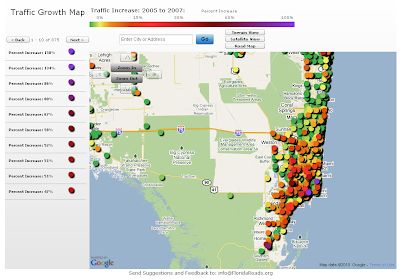
Found this site thru one of my GIS blog feeds. I would be curious to disect the data to look at differences in traffic congestion "off-season" and during the "snowbirds's arrival". The site allows for the standard "pan/zoom" or you and select by community/town of interest.
From the site:
"The Florida Traffic Growth Map highlights the busiest roads and highways. From 2005-2007, many roads and highways have seen at least a 50% increase in traffic. The map highlights the pace of change and increased utilization of Florida's infrastructure. In some areas the road conditions have changed significantly. The data is derived from the Florida Department of Transportation website. Each icon represents the location of a traffic counter and once clicked shows the annual average daily traffic (AADT) counts...."
http://floridaroads.org/

Found this site thru one of my GIS blog feeds. I would be curious to disect the data to look at differences in traffic congestion "off-season" and during the "snowbirds's arrival". The site allows for the standard "pan/zoom" or you and select by community/town of interest.
From the site:
"The Florida Traffic Growth Map highlights the busiest roads and highways. From 2005-2007, many roads and highways have seen at least a 50% increase in traffic. The map highlights the pace of change and increased utilization of Florida's infrastructure. In some areas the road conditions have changed significantly. The data is derived from the Florida Department of Transportation website. Each icon represents the location of a traffic counter and once clicked shows the annual average daily traffic (AADT) counts...."
Wednesday, March 24, 2010
SRC Becomes Alteryx®, LLC

The Alteryx brand has emerged as a leader in the current spatial business intelligence revolution. SRC, LLC has changed its company name to Alteryx, LLC; the product brand introduced in 1997 has become the strongest standalone Geographic Business Intelligence® software platform in the world today.
The Alteryx technology has matured into the first integrated business intelligence platform that delivers a comprehensive set of software, data and services serving local, regional and global markets. “Within our user base, the Alteryx name already identifies our company, and is well known within the international developer community as the trusted leader in streamlining disparate data sources into enterprise workflows,” said Dean Stoecker, Alteryx, LLC CEO and president. “Taking on the Alteryx brand as our company name is a natural evolution of our business, and represents an industry milestone in embedding spatial data into all levels of business logic. We are extending Geographic Business Intelligence to better business strategies and operational decision-making taking place every day across industry, government and academic disciplines.”
Read more
Friday, March 19, 2010
Sunday, February 28, 2010
Mapping Earthquakes & Tsunamis: Chile's recent magnitude 8.8 quake
For visual representations of the earthquake and resulting tsunami, here are two great government sources; USGS & NOAA.
From USGS, the have a detailed site (image below):
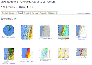
For NOAA, here are a few quick map highlights of the resulting tsunami.
Energy Forecast in wave height:


" The Richter magnitude scale, also known as the local magnitude (ML) scale, assigns a single number to quantify the amount of seismic energy released by an earthquake. .... So, for example, an earthquake that measures 5.0 on the Richter scale has a shaking amplitude 10 times larger than one that measures 4.0. The effective limit of measurement for local magnitude ML is about 6.8...."
From USGS, the have a detailed site (image below):
For NOAA, here are a few quick map highlights of the resulting tsunami.
Energy Forecast in wave height:

Timetracker of wave position:

" The Richter magnitude scale, also known as the local magnitude (ML) scale, assigns a single number to quantify the amount of seismic energy released by an earthquake. .... So, for example, an earthquake that measures 5.0 on the Richter scale has a shaking amplitude 10 times larger than one that measures 4.0. The effective limit of measurement for local magnitude ML is about 6.8...."
Mapping for the Gold - Olympics Style:Vancouver’s Olympic Venues

My family & I have really enjoyed this year's Olympic saga. Having some co-workers from Vancouver and parts of Canada added "a nice flair" to watching the events. My favorites - skeleton, short track & anything freestyle. Seemed appropriate to give the Olympics its credit with a map related post. This was first posted online at the NY Times site.
Credits:
Interactive map from the NY Times by SHAN CARTER, MATTHEW ERICSON and JOE WARD; Additional reporting by Melissa Hoppert .
Sources: Elevation data by Intermap Technologies Inc.; satellite photographs by DigitalGlobe, Province of British Columbia and TerraMetrics via Google Earth
A perspective on scale - from point to universe
I like this a short film "The Known Universe" from the American Museum of Natural History, “shows the known universe as mapped through astronomical observations....”. We begin from a point on earth, in this case the Himalayan Mountain range, and then rapidly "expand outwards". This portion of the movie where it shows the “fields of mapped space” intrigued me, particularly the astronomical swath of obscured vision that is "uncharted space". This puts you "in your place" a bit, but is still a rewarding perspective.
Monday, February 15, 2010

Monday, February 08, 2010
Sinam's Favorite Super Bowl ad - Simpson's Coke "Sell Out"
This was an easy choice, as my allegiance to Coca Cola is literally "tattooed" on my ribs - and I've been a Simpson fan for decades. Tame by most measures, and a shameless "sell-out" - but suitable to the "my generation" they are targeting.
Wal-Mart Tightens Delivery Deadlines
Wal-Mart Tightens Delivery Deadlines
Article on balancing Wal-Mart vendor requirements for supply chain inventory mgmt & just in time delivery.
Posted using ShareThis
Article on balancing Wal-Mart vendor requirements for supply chain inventory mgmt & just in time delivery.
Posted using ShareThis
Thursday, January 28, 2010
GeoSinam - Wordle Colliage

Thursday, January 14, 2010
Cool Geo-Pic: Currents Collide and Coastal Waters Bloom off Patagonia
This Cool Geo-Pic comes again from NASA's Earth Observatory. I love the nutrient patterns based on the blooms from change ocean currents. The pathways from my fridge to the couch are much less interesting ....

Quick "Cut & Paste" Highlights:
" ...Located over the continental shelf of southeastern South America is one of the world’s most productive and complex marine ecosystems. Covering about 1.2 million square kilometers (4.6 million square miles) of coastal waters, the Patagonia Large Marine Ecosystem stretches from the Rio de le Plata (a wide estuary at the mouth of the Paraná River) to the southern tip of the continent...."
"... In November 2009, as summer approached in the Southern Hemisphere, the foundation of the ecosystem’s food web—plant-like microorganisms called phytoplankton—bloomed expansively, brightening the waters with living ribbons of color...."
"....The sea surface temperature image (right) reveals one of the reasons for the region’s productivity: the convergence of two wind-driven ocean currents. The warm, salty Brazil Current meanders south over the continental shelf, where it meets the cold, less-salty Falklands/Malvinas Current, a north-flowing branch off the Antarctic Circumpolar Current...."
"....In the spring and summer, the convergence zone occurs at about the latitude of the Rio de la Plata, which is where it seems to be based on the water temperatures shown in the sea surface temperature image. Blues and purples (cooler water) dominate the image south of the estuary, while pinks and yellows (warmer water) dominate the image north of there...."
Full Article - Click Here
References / Credits:
These images are made from data collected by the Moderate Resolution Imaging Spectroradiometer (MODIS) on NASA’s Aqua satellite in November 2009. Aqua has been collecting data on the ecological and physical state of the ocean since its launch in 2002. Monthly maps of chlorophyll and sea surface temperature from Aqua are available in Global Maps on the Earth Observatory.
NASA Earth Observatory images created by Jesse Allen, using data provided courtesy of the Ocean Color Group team at NASA’s Goddard Space Flight Center. Caption by Rebecca Lindsey.
Instrument:
Aqua - MODIS
Cool Geo-Pic: Winter Temperatures and the Arctic Oscillation
This Cool Geo-Pic comes again from NASA's Earth Observatory. What I find fascinating is that the changes in climate patterns vary by geography, terrain and element (land/water).

Quick "Cut & Paste" Highlights:
" ... Much of the Northern Hemisphere experienced cold land surface temperatures, but the Arctic was exceptionally warm. This weather pattern is a tale-tell sign of the Arctic Oscillation.
The Arctic Oscillation is a climate pattern that influences winter weather in the Northern Hemisphere. It is defined by the pressure difference between air at mid-latitudes (around 45 degrees North, about the latitude of Montreal, Canada or Bordeaux, France) and air over the Arctic. A low-pressure air mass usually dominates the Arctic, and while higher pressure air sits over the mid-latitudes.
This pressure difference generates winds that confine extremely cold air to the Arctic. Sometimes, the pressure systems weaken, decreasing the pressure difference between the Arctic and midlatitudes and allowing chilly Arctic air to slide south while warmer air creeps north..... When the pressure systems are strong, the Arctic Oscillation is positive.... Cold Arctic air chilled the land surface at midlatitudes, while Arctic land, such as Greenland and Alaska, was much warmer than usual...."
Full Article - Click Here
References / Credits:
Climate Prediction Center. (2010, January 8). Arctic Oscillation. National Weather Service, National Oceanic and Atmospheric Administration. Accessed January 8, 2010.
National Snow and Ice Data Center. The Arctic Oscillation. Accessed January 8, 2010.
Wallace, J.M. (2000, July 17). On the Arctic and Antarctic Oscillations. University of Washington. Accessed January 8, 2010.
National Snow and Ice Data Center. (2010, January 5). Extreme negative phase of the Arctic Oscillation yields a warm Arctic. Accessed January 8, 2010.
NASA Earth Observatory image by Kevin Ward, based on data provided by the NASA Earth Observations (NEO) Project. Caption by Holli Riebeek.
Instrument: Terra - MODIS
Friday, January 08, 2010
Cool Geo-Pic: A Global Good Mornin' to Ya
This cool Geo-Pic shows "Good Morning" tweets.
Full credits to Jer Thorp : blog.blprnt.com GoodMorning! Full Render #2 from blprnt on Vimeo.
Per the site: " GoodMorning! is a Twitter visualization tool which shows about 11,000 tweets collected over a 24 hour period between August 20th and 21st. The tweets were harvested to find people saying 'good morning' in English as well as several other languages.The tweets appear as blocks and are colour-coded. Green tweets are early in the morning, orange tweets are at about 9am, and red tweets are later in the morning. Black tweets are 'out-of-time' messages (sent at times that aren't in the morning at that location)....."
GoodMorning! Full Render #2 from blprnt on Vimeo.
Cool Geo-Pic: Planetary Visualization of the S&P 500
This Cool Geo-Pic blends planetary rotations to stock performance. Helps me understand why my stock portfolio went from the size of Jupiter to the mini-moon of Pluto.
STOC (Stock Ticker Orbital Comparison) data visualization from UAT Media on Vimeo.
Subscribe to:
Posts (Atom)