
Monday, December 28, 2009
Tuesday, December 22, 2009
Cool Geo-Pic: The Geography of Jobs
 This cool Geo-Pic comes from TIP Streategies in Austin, TX.
 From their site:
This animated map provides a striking visual of employment trends over the last business cycle using net change in jobs from the U.S. Bureau of Labor Statistics on a rolling 12-month basis. Read more…
Posted using ShareThis
Cool geo-Pic: Mediterranean Region by Population
 This cool Geo-Pic comes from the United Nations GRID-Arendal Maps & Graphics feed.
 They have a similar series on migration, water supply, environment & security.
Desertification Environment and Security in the Mediterranean: Desertification
Non-renewable Natural Resources Environment and Security in the Mediterranean: Non-renewable Natural Resources
Population Environment and Security in the Mediterranean: Population
Water Environment and Security in the Mediterranean: Water
Migration Environment and Security in the Mediterranean: Migration
Agriculture and Fisheries Environment and Security in the Mediterranean: Agriculture and Fisheries
Credits:
Titled Picture: Population. Environment and Security in the Mediterranean: Population
Source: Center for International Earth Science Information Network (CIESIN), Columbia University; World Gazetteer
Cartographer/Designer: Emmanuelle Bournay and Matthias Beilstein, Zoï Environment Network
Appears in : Environment and Security Issues in the Southern Mediterranean Region
Published: 2009
Sunday, October 04, 2009
Cool Geo-Pic: Lake Tiberias (Sea of Galilee), Northern Israel
,+Northern+Israel.png)
This Cool Geo-Pic comes again from NASA's Earth Observatory.
".... Israel’s largest freshwater lake, Lake Tiberias, is also known as the Sea of Tiberias, Lake of Gennesaret, Lake Kinneret, and the Sea of Galilee. The lake measures just more than 21 kilometers (13 miles) north-south, and it is only 43 meters (141 feet) deep. The lake is fed partly by underground springs related to the Jordan sector of the Great Rift Valley
, but most of its water comes from the Jordan River, which enters from the north. The river’s winding course can be seen draining the south end of the lake at image bottom...."
".... Ruins of the famous biblical town of Capernaum, re-discovered in 1838 by the American explorer Edward Robinson, lie just north of Tiberias on the northwestern shore of Lake Tiberias. Excavations have revealed a synagogue from the fourth or fifth century, making it one of the oldest in the world...."
".... Ruins of the famous biblical town of Capernaum, re-discovered in 1838 by the American explorer Edward Robinson, lie just north of Tiberias on the northwestern shore of Lake Tiberias. Excavations have revealed a synagogue from the fourth or fifth century, making it one of the oldest in the world...."
Astronaut photograph ISS020-E-31066 was acquired on August 15, 2009, with a Nikon D2Xs digital camera fitted with an 400 mm lens, and is provided by the ISS Crew Earth Observations experiment and Image Science & Analysis Laboratory, Johnson Space Center. The image was taken by the Expedition 20 crew. The image in this article has been cropped and enhanced to improve contrast. Lens artifacts have been removed. The International Space Station Program supports the laboratory to help astronauts take pictures of Earth that will be of the greatest value to scientists and the public, and to make those images freely available on the Internet. Additional images taken by astronauts and cosmonauts can be viewed at the NASA/JSC Gateway to Astronaut Photography of Earth. Caption by M. Justin Wilkinson, NASA-JSC.
Instrument:
ISS - Digital Camera
Thursday, October 01, 2009
Cool Geo-Pic: Antarctic Ozone Hole 2009

This Cool Geo-Pic comes again from NASA's Earth Observatory. The news of ozone decade is cautiously optimitistic as the rate of decay seems to be "holding" for now ....
Quick "Cut & Paste" Highlights:
" ... The annual ozone hole started developing over the South Pole in late August 2009, and by September 10, it appeared that the ozone hole of 2009 would be comparable to ozone depletions over the past decade. This composite image from September 10 depicts ozone concentrations in Dobson units, with purple and blues depicting severe deficits of ozone. The image was made from data collected by the Ozone Monitoring Instrument onboard NASA’s Aura satellite...."
"...Recent observations and several studies have shown that the size of the annual ozone hole has stabilized and the level of ozone-depleting substances has decreased by 4 percent since 2001. But since chlorine and bromine compounds have long lifetimes in the atmosphere, a recovery of atmospheric ozone is not likely to be noticeable until 2020 or later.
Visit NASA’s Ozone Watch page for current imagery, data, and animations of the year to date..."
Full Article - Click Here
References / Credits:
Antarctic Ozone Hole: 1979 to 2008
Climate Change and Atmospheric Circulation Will Make for Uneven Ozone Recovery
New Simulation Shows Consequences of a World Without Earth's Natural Sunscreen
Ozone Day 2009
What’s Holding Antarctic Sea Ice Back From Melting?
NASA image courtesy Ozone Watch. Caption by Michael Carlowicz.
Instrument:
Aura - OMI
Sunday, September 27, 2009
Cool Geo-Vid: Moon Crashing
I had to come up with a new term for this one: "Geo-Vid". Taken from video footage of Japan's KAGUYA spacecraft (care of JAXA), this "fly by crash" just looks too serene to be real.
First brought to my attention by NASA's Astronomy Picture of the Day , below are the "Cut & Paste" Highlights:
".... Japan's Kaguya spacecraft crashed into the Moon [June 2009], as planned. Officially named the Selenological and Engineering Explorer (SELENE), the spacecraft was given the nickname Kaguya after the princess in the Japanese folklore story The Tale of the Bamboo Cutter. Pictured above is a movie taken by Kaguya during the last orbit of its twenty-month lunar mission. A desolate, hilly, and cratered terrain passes underneath as the spacecraft barely clears a few peaks. At the movie's end, the spacecraft disappears into darkness near Gill crater. Robotic SELENE carried thirteen scientific instruments and two HDTV cameras. The groundbreaking mission took data on lunar topology and composition that are being used to better understand the origin and history of Earth's unique and ancient companion. Data and images from and the recently launched Lunar Reconnaissance Orbiter could be used to choose good locations to land future Moon-exploring astronauts...."
Full Credits:
NASA's Astronomy Picture of the Day
JAXA's Kaguya Lunar Project
Friday, September 25, 2009
Mapping "Madoff Crime"- Victim Density for Florida & New York
These snapshots came from the Madoff Victim Map List of Madoff Clients wesite at www.MadoffMap.com I chose two locations, downtown New York and South Florida as examples.

Taken from the Site - "Cut & Paste" Highlights:
"... Each client's location is mapped with an icon showing the density of nearby Madoff clients. The icon colors range from green to red creating a heat map effect across the United States. The density of Madoff clients is greatest in Florida, New York and California. ..."

Cool Geo-Pic: Space Debris
 This Cool Geo-Pic comes again from NASA's Earth Observatory. At first this is a very startling image of "trash in space". Luckily the dots are not to scale, and can be compared to other exaggerations of "blackening the sky...".
Quick "Cut & Paste" Highlights:
" ... Orbital debris, or “space junk,” is any man-made object in orbit around the Earth that no longer serves a useful purpose. Space junk can be bad news for an orbiting satellite.
The dots between the geostationary orbit and the low-Earth orbit are in an orbit used by GPS satellites or a highly elliptical orbit, called Molniya, used to monitor the far north or south. To read more about common satellite orbits, see Catalog of Earth Satellite Orbits on the Earth Observatory...."
"....Though the black dots that represent objects in space swarm around the Earth, obscuring the surface in the lower image, the space junk situation is not as dire as it may appear. The dots are not to scale, and space is a very big place. Collisions between large objects are fairly rare...."
NASA Orbital Debris Program Office. (2009, July). Orbital debris frequently asked questions. Accessed September 11, 2009.
Tuesday, September 22, 2009
Cool Geo-Pic: North Pole Sea Ice Minimum 2009
 This Cool Geo-Pic comes again from NASA's Earth Observatory. Part of larger series on measuring the loss of one million square miles of polar ice in the Arctic Ocean, it highlights the pace of the ice loss.
 Nothing about this is "new to the planet" except for THE RATE OF CHANGE.
Fluctuations in sea level (30 meters lower as recent as 20,000 years ago) - once measured in centuries and millennia are now occurring over decades.
Quick "Cut & Paste" Highlights:
" ... On September 12, 2009, sea ice in the Arctic Ocean most likely reached its minimum extent for 2009, said the National Snow and Ice Data Center. The reach of Arctic sea ice fluctuates through the year, growing in the winter and shrinking through the summer...."
"....This image illustrates the 2009 minimum on September 12, when ice covered 5.10 million square kilometers (2.97 million square miles) of the Arctic Ocean. The average minimum between 1979 and 2000, outlined in yellow, was 6.71 million square kilometers...."
"....The graph illustrates the difference between 2009, 2008, and 2007 sea ice extent and the average extent. Sea ice covered a smaller area in 2009 compared to 2008 until August, at which point ice loss in 2008 surpassed 2009. Neither year came close to 2007, which was low from the start of the melt season. All years were significantly below average...."
"....To see how sea ice has changed since 2000, see the Earth Observatory’s World of Change entry on Arctic Sea Ice...."
Full Article - Click Here
References / Credits:
National Snow and Ice Data Center. (2009, September 17). Arctic sea ice reaches annual minimum extent. Accessed September 18, 2009.
Scott, M. (2009, April 20). Sea Ice. NASA’s Earth Observatory. Accessed September 18, 2009.
NASA images created by Jesse Allen and Rob Simmon, using AMSR-E sea ice concentration data provided courtesy of the National Snow and Ice Data Center. Caption by Holli Riebeek.
Instrument: Aqua - AMSR-E
Monday, September 21, 2009
Cool Geo-Pic - Fires in Los Angeles County

This Cool Geo-Pic comes again from NASA's Earth Observatory. I particularly liked how the image reveals the difficult canyon terrain that challenged fire fighting efforts.
Quick "Cut & Paste" Highlights:
" ... Two weeks after an arsonist ignited the drought-dry forest north of Los Angeles, the Station fire had become the ninth largest fire in California since 1933...."
" .... On the morning of September 8, 2009, the fire had burned more than 250 square miles (about 650 square kilometers) of land, according to the Station Fire Incident Report from September 8.... "
" ....This image, captured by the Advanced Spaceborne Thermal Emission and Reflection Radiometer (ASTER) on NASA’s Terra satellite on September 6, shows the extent of the burned area. ...."
" .... The burned area covers much of the San Gabriel Mountains, edging down into residential areas northwest of Pasadena .... The image also illustrates why fighting the Station fire has been so difficult. The fire burned over steep mountains riddled with canyons. The rugged landscape looks wrinkled, particularly in the burned area where plants no longer soften the ridgelines and canyons .... "
Full Article - Click Here
References / Credits:
Full Article - Click Here
References / Credits:
Bloomekatz, A.B. (2009, September 6). Station fire, among state’s top 10, moves toward Littlerock, Juniper Hills. Los Angeles Times. Accessed September 8, 2009.
InciWeb. (2009, September 8). Station Fire. Accessed September 8, 2009.
Mount Wilson Observatory. Accessed September 8, 2009.
More images of this event in Natural Hazards
NASA image created by Jesse Allen, using data provided courtesy of NASA/GSFC/METI/ERSDAC/JAROS, and U.S./Japan ASTER Science Team. Caption by Holli Riebeek.
Instrument:
Terra - ASTER
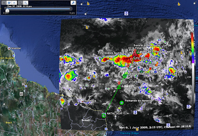
Cool Geo-Pic: Hurricane Jimena by Visual & Radar
 This Cool Geo-Pic comes again from NASA's Earth Observatory.
What I like most about the image is the "satellite to radar" comparison. I can happily report "all has been quiet" on the hurricane front for us Floridians.
Quick "Cut & Paste" Highlights:
" ... The center of Hurricane Jimena was coming ashore over Baja California on September 2, 2009, when these images were taken. The top image is from the Moderate Resolution Imaging Spectroradiometer (MODIS) on NASA’s Aqua satellite. The lower image was made from data collected by a radar instrument flying on the Cloudsat satellite. Together, the images show the structure of the Category 1 hurricane shortly after it make landfall. The storm brought both damaging wind and drought-breaking rain to the peninsula...."
Full Article - Click Here
download large image (32 KB, PNG) acquired September 2, 2009
References / Credits:
National Hurricane Center. (2009, September 4). Hurricane Jimena Advisory Archive. National Oceanic and Atmospheric Administration, National Weather Service. Accessed September 4, 2009.
Stevenson, M. (2009, September 3). Jimena weakening after plowing into Mexico. Associated Press. Accessed September 4, 2009.
More images of this event in Natural Hazards
NASA image created by Jesse Allen, using CloudSat FirstLook data provided courtesy of the CloudSat team at Colorado State University.
Instrument:
CloudSat - CPR
Valuing a Vertical Industry Over Time - a Visual Perspective

Taken from Inc and first brought to my attention from FlowingData
the interactive site allows a measure of business evaluation by vertical industry.
For my collage example, I examined Prepackaged Software and changes in valuation from 2002 to 2009. Its allows for you enter your own company's valuation figures; enter your Net Sales, Gross Profit, EBIT/EBITA, Earnings & BVIC to obtain your valuation score.
For my collage example, I examined Prepackaged Software and changes in valuation from 2002 to 2009. Its allows for you enter your own company's valuation figures; enter your Net Sales, Gross Profit, EBIT/EBITA, Earnings & BVIC to obtain your valuation score.
From the Business Buyer's Guide:
" .... For the sixth year, Inc. has partnered with Business Valuation Resources to produce our guide to valuing your business. The graphics, tables, and work sheets that make up this guide -- which are based on 2,168 transactions from January 1, 2007, to March 31, 2009, in 122 industries -- can help you get a sense of what has happened to your business's worth in this economy...."
Full Credits on Interactive graphic designed by Tommy McCall & Data from Business Valuation Resources
Tuesday, September 15, 2009
California Stimulus: Interactive Mapping of Spend
 Taken from the California Economic Recovery Portal, a brilliant interactive display of stimulus spend throughout the state of California. My image collage highlights Orange County.
Full Credits to Stamen.com and Flowing Data for bringing this to "life & attention". MapTiles by CloudMade and data CC by SA OpenStreetMap.org
Monday, August 31, 2009
National Unemployment - Interactive Map

This came to my attention from The Map Room, MapHawk and others.
I used the interactive state selection to map 5 states of personal interest, looking at there comparative change in unemployment. This line graph illustrates California, Colorado, Florida, Michigan & Virginia.
I used the interactive state selection to map 5 states of personal interest, looking at there comparative change in unemployment. This line graph illustrates California, Colorado, Florida, Michigan & Virginia.
Data Source: Bureau of Labor Statistics
Full credits to: Mel Lan-Ho Walker, Susan McGregor, Ana Rivas, Jennifer Valentino-DeVies at WSJ.com
Thursday, July 30, 2009
Just Released - Death & Taxes 2010
For all of you not familiar with "Death and Taxes", this is a site that produces an interactive graphical display (posters also available) now three years running of the federal budget. It contains over 500 programs and departments and almost every program that receives over 200 million dollars annually. The data is straight from the president's 2010 budget request and will be debated, amended, and approved by Congress to begin the fiscal year. All of the item circles are proportional in size to their spending totals and the percentage change from 2009 is included to spot trends and disproportion.
Its a great way to compare NASA to the NSA, Homeland Security to Healthcare, etc. - from a budget expenditure perspective.
Its a great way to compare NASA to the NSA, Homeland Security to Healthcare, etc. - from a budget expenditure perspective.
A Story of Four Bad Bears ....
 As the story goes, Goldilocks never met bears like these.... a historical comparison of four "bad bear markets"; the Dow Crash of 1929, the Oil Crisis in 1973, the Tech Crash of 2000 and the current recession.
I found this on DShort.com , there is also a great job loss comparison with four different looks at the recession from Flowing Data .
Again, the graphical display over time seem most relevant in communicating financial turmoil.
The second image is from Calculated Risk as of the February job loss numbers. One can imagine with the huge hemorrhaging of jobs in the last six months our "line" has sunk quite a bit further.

Tuesday, July 28, 2009
Another $800 Billion visual perspective

As I continued to research, I came across another more detailed visual portrayal of the economic stimulus plan.
This one has a better temporal dynamic on the axis showing the impact over time from fiscal year 2009 thru 2019.
In particular, the large numbers from Medicaid provisions, state fiscal stabilization and health insurance for the unemployed are now "top of mind" political topics in their own right.
The Obama Stimulus Plan - A Visual Refresher
 As funny as it sounds in today's economic times, I need a refresher on where the $800 billion stimulus plan went .... So I dug up some visual displays of Obama's economic plan.
This particular collage comes from InfoGraphics - as first seen on FlowingData
You would think after only six months of spending this type of cash each 100 million would be etched into our brains, but alas .... even nearly a trillion is but a fleeting memory.
I was mostly interested in reviewing the ratio of tax cuts to aid to local/state governments given the State of California's recent budget debacle.
As always, the visual provides some clarity (at least as to the categories of spend) on how to interpret the data.
Thursday, July 23, 2009
Cool Geo-Pic: Eclipse - Prophesy or Shadow? Depends on your point of view.

This Cool Geo-Pic comes again from NASA's Earth Observatory. While I've seen some wonderful eclipse images, this is the first that's from the "moon"s point of view".
Funny how a prophetic event to one, is just a shadow to another. Makes me wonder what an ant dreams up when he encounters my "looming darkness" on a sunny Sunday sidewalk stroll. Eghads! It blocks out the sun!
Another example that all things are relative to your point of view.
Quick "Cut & Paste" Highlights:
" ... The Moon’s shadow engulfed Taiwan and a large swath of southeastern China and the Pacific Ocean on the morning of July 22, 2009, during an unusually long total eclipse of the Sun. This pair of images from the Japanese geostationary satellite MTSAT show the view of Earth at 8:30 a.m. local time in Taiwan (left) and an hour later (right), near the time in eastern China when the disk of the Moon completely overlapped the disk of the Sun (called totality). The longest period of totality occurred over the Pacific, where the total eclipse lasted more than 6 minutes...."
download large 8:30 image image (90 KB, JPEG) acquired July 22, 2009
download large 9:30 image image (94 KB, JPEG) acquired July 22, 2009
Exploratorium.edu. (n.d.) Total Solar Eclipse, July 22, 2009. Accessed July 22, 2009.
U.S. Naval Observatory. (n.d.) The Sky This Week, 2009 July 17 – 24. Accessed July 22, 2009.
Espenak, F. (n.d.) Total Solar Eclipse of 2009 July 22. NASA Eclipse Website. Accessed July 22, 2009.
Images provided by WebGMS–MTSAT/GMS (HIMAWARI) Website, Institute of Industrial Science & Earthquake Research Institute, University of Tokyo, Japan.
Instrument:
MTSAT
Saturday, July 04, 2009
Cool Geo-Pic: Atlantic Ocean Temperatures

This Cool Geo-Pic comes again from NASA's Earth Observatory. Given my daughter was born between to hurricance passes, this is always something on interest to us "New Floridians".
Quick "Cut & Paste" Highlights:
" ...The first month of the 2009 Atlantic hurricane season drew to a close without so much as a tropical storm, but that isn’t unusual. According to the National Hurricane Center, the 1944-2002 average for named storms in June was only about 0.75, which means they don't occur every year. When they do form, it is usually the Gulf of Mexico that brews them up, and this image of sea surface temperatures on June 30, 2009, shows why...."
Full Article - Click Here
References / Credits:
National Hurricane Center. Tropical Cyclone Climatology. Accessed July 1, 2009.
NASA image by Jesse Allen and Robert Simmon. Caption by Rebecca Lindsey.
Instrument:
Aqua - MODIS
NASA image by Jesse Allen and Robert Simmon. Caption by Rebecca Lindsey.
Instrument:
Aqua - MODIS
Cool Geo-Pic: Fire Season in a Rain Forest

This Cool Geo-Pic comes again from NASA's Earth Observatory. What can create a fire season in a rain forest? Us, of course.
Quick "Cut & Paste" Highlights:
" ...Prior to widespread human settlement and forest clearing, there was no such thing as a fire season in the Amazon Rainforest. The ability of trees to draw water up from deep underground during the annual dry season and a lack of natural fire triggers—lightning rarely occurs without rain—meant that in most places, a fire might occur once in several hundred—or perhaps as many as 1,000—years. Today, burning begins in August, generally peaks in September, and tapers off by October; during these months, the skies over the Amazon fill with smoke ......"
"..... Scientists use the amount of smoke and fires in the Amazon as an indicator of how much of the Amazon was cleared or degraded each year, but the burning has other impacts. Fires release large amounts of carbon dioxide into the atmosphere, adding to global warming. And the smoke chokes off cloud formation, which changes the Amazon’s energy balance: fewer clouds mean more sunlight reaches the surface, which leads to warming."
Full Article - Click Here
References / Credits:
Full Article - Click Here
References / Credits:
Koren, I., Remer, L., and Longo, K. (2007). Reversal of trend of biomass burning in the Amazon. Geophysical Research Letters,34, L20404, doi:10.1029/2007GL031530.
Lindsey, R. (2004). From Forest to Field: How Fire is Transforming the Amazon. NASA’s Earth Observatory. Accessed June 29, 2009.
Lindsey, R. (2008). Amazon Fires on the Rise. NASA’s Earth Observatory. Accessed June 29, 2009.
Torres, O. . Chen, Z., Jethva, H., Ahn, C., Freitas, S.R., and Bhartia, P.K. (2009). OMI Observations of the Anomalous 2008 Southern Hemisphere Biomass Burning Season. Manuscript submitted for publication.
NASA image created by Jesse Allen, based on OMI aerosol data provided by Omar Torres and Changwoo Ahn (Hampton University). Caption by Rebecca Lindsey.
Instrument:
Aura - OMI
Friday, June 19, 2009
Air France Flight 447 - Google Earth Map
I found this Google Earth flight path representation of Air France Flight 447.
My wife is a Flight Attendant & I had a "start-up career deviation" in aviation, so I'm a biased source.

My wife is a Flight Attendant & I had a "start-up career deviation" in aviation, so I'm a biased source.
overlay of a weather map at the time of the crash
I'm not going to comment on this one, other than to offer my condolences to the crew & passenger families - and recognize that "aviation people" are some of the best folk I have ever met & had the pleasure to work with....If you seek more info - View article...
I'm not going to comment on this one, other than to offer my condolences to the crew & passenger families - and recognize that "aviation people" are some of the best folk I have ever met & had the pleasure to work with....If you seek more info - View article...
Monday, June 15, 2009
Mapping Twitter - Present & Future
 As far as Twitter is concerned, I still consider myself a "well-informed Luddite". With that said, from those that know, below is a visual mapping juxtaposing Twitter's presence reach to it's branching future. Full links describe both.
Per Flowing Data, " ... The below flow chart from Steve Rubel shows Twitter's possible future while the above from Brian Solis and Jess3 shows all the spawns of Twitter data.,...".
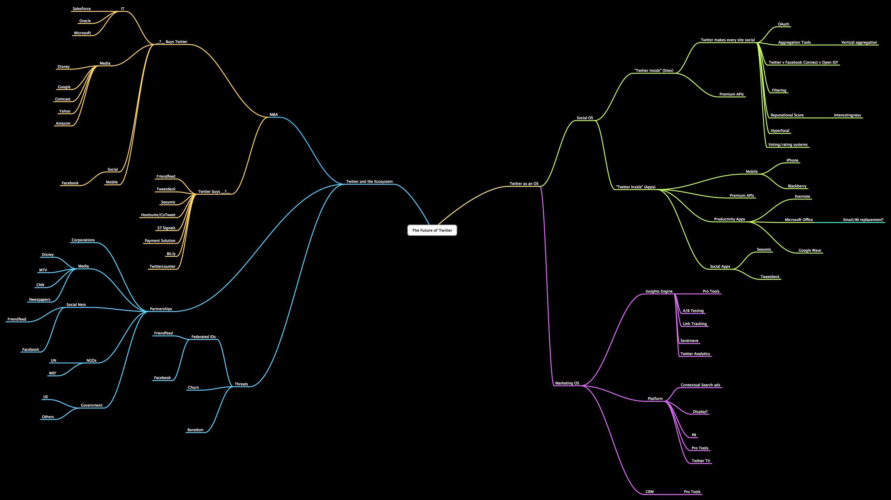
I've just "halved" the images for easy display. Welcome to the TwitterVerse? Perhaps .....
Monday, June 01, 2009
A Link Worth Watching: Where 09: "Decoding the Urban DNA and Harnessing the Power of Social Intelligence"
From Sense Networks at the the O'Reilly Where '09 conference - the data driven analysis to incorporate the variety of social interactions and activities in a certain locale - as they vary by "time of day" and "day of week" dimensions - made this a really fascinating presentation.
Full credits to Sense Networks CEO:
" Mr. Skibiski is Chairman and Chief Executive Officer of Sense Networks. He is responsible for the company’s overall strategic vision in the financial and consumer services markets...."
Full credits to O'Reilly where 2.0:
" Now in its fifth year, the Where 2.0 Conference is where the grassroots and leading edge developers building location aware technology intersect with the businesses and entrepreneurs seeking out location apps, platforms, and hardware to gain a competitive edge. In the O'Reilly conference tradition, Where 2.0 presents leading trends rather than chasing them...."
Thursday, May 28, 2009
A Map for Memorial Day - Sobering remembrance
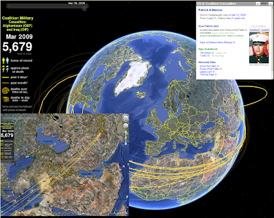 I spent the Memorial Weekend in the Washington DC area. We celebrated my son's 8th birthday, toured the Air & Space Museum, and heard the roar of the Rolling Thunder bikers as they massed on the mall for remembrance of our soldiers' sacrifice.
This particular site (www.MapTheFallen.org) seemed to capture my mixed emotions on the two wars and the sacrifice born by our military. I wish I could bring them all back, and hope this site continues to geographically illustrate their deeds, and emphasize the eternal thanks we owe them all.
In the Google Earth environment, you are able to see home of record, approximate place of death, and other thematic/temporal representations.
Saturday, May 16, 2009
Visualizing the US Alternative Power vs. Current Grid
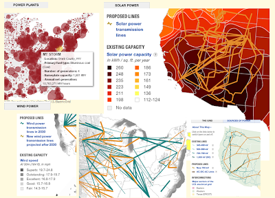
This visualization of the current national power grid and comparisons of several alternative energy "landscapes" (Solar, Wind, etc.) is an intriguing comparison of current power network to potential new sources of energy in an environment of ever increasing "power-hungry" demand.
Quick "Cut & Paste" highlights:
The nation’s electricity grid is facing a crisis -- it’s outdated and unprepared for increasing demand and a future that includes more renewable sources of energy. A new digital smart grid is part of the picture envisioned by advocates, as is building new electricity infrastructure.
Credits:
To Flowing Data for bringing it to my attention, and these NPR folk (below) for putting it together:
Sources: American Electric Power, American Wind Energy Association, Center for American Progress, Department of Energy, Edison Electric Institute, Energy Information Administration, Electric Power Research Institute, Federal Energy Regulatory Commission, National Renewable Energy Laboratory, U.S. Environmental Protection Agency, Western Resource Advocates
Credits: Producer: Andrew Prince; Designer: Alyson Hurt; Editors: Avie Schneider and Vikki Valentine; Supervising Editors: Anne Gudenkauf and Quinn O'Toole; Additional Research: Jenny Gold; Database and GIS Analysis: Robert Benincasa
Tuesday, May 12, 2009
When I Finally Go .... I want to be a Drop in the Ocean
I saw this on BBC and thought ..."Yup, that's a neat way to go into the Great Beyond".
Thursday, April 30, 2009
The World's Largest Populations Require Glacier Melt for Water Flow - a Map Display

This Cool Map comes from the UNEP/GRID Maps Library. What seems most telling, is that 3 billion+ people rely on glacier melt water flow for their basic water requirements. This is the most stark example I have have seen on the "inland" impact from climate change.
" ...Many of the largest rivers in the Himalayas Hindu Kush region are strongly dependent upon snow and glacial melt for waterflow. Many of the largest rivers in the Himalayas Hindu Kush region are strongly dependent upon snow and glacial melt for waterflow. Except for the fact that glaciers are melting rapidly in many places, we do not have adequate data to more accurately project when and where water scarcity will affect irrigation schemes in full. Making accurate projections is also difficult because of variations in the effects on ground and surface water, as well as on water for urban needs and industrial purposes Furthermore, the cost of water may also increase, seriously complicating the water scarcity question. Recent studies show that cost of water has increased by about 400–500% since 1990 in the Indo-Gangetic Basin of India..."
Full Article - Click Here
Download this graphic in png format, 1812 KB , suitable for web-sites, documents or presentations.
Download this graphic in tif format, 4501 KB, suitable for print and editing.
Download this graphic in jpg format, 1242 KB , suitable for web-sites, documents or presentations.
References / Credits:
(Source: Rees and Collins, 2004; UNEP, 2007).
Link to web-site http://www.grida.no/publications/rr/food-crisis/
Cartographer/Designer Ieva Rucevska, UNEP/GRID-Arendal
Appears in Environmental Food Crisis
Published 2009, Joel Benoit
Link to web-site http://www.grida.no/publications/rr/food-crisis/
Cartographer/Designer Ieva Rucevska, UNEP/GRID-Arendal
Appears in Environmental Food Crisis
Published 2009, Joel Benoit
Wednesday, April 29, 2009
Mapping Trends in Employment - a Visual Comparison by Year

This interactive map display pits the temporal display of thematic data; i.e. Mapping Trends in Employment - a Visual Comparison by Year.
Full credits to:
An interactive map of vanishing employment across the country. - By Chris Wilson - Slate Magazine.
An interactive map of vanishing employment across the country. - By Chris Wilson - Slate Magazine.
Tuesday, April 28, 2009
Cool Geo-Pic: Amount of Old Ice in Arctic Hits Record Low in February 2009

This Cool Geo-Pic comes again from NASA's Earth Observatory. While the loss of perennial sea ice opens trade routes, its seems a pale trade-off given the global impact of climate change, sea level rise and the more imaginative tales of polar shift.
Quick "Cut & Paste" Highlights:
" ...The summer minimum and the winter maximum are the two pivotal milestones in the annual cycle of Arctic sea ice. The thickness of sea ice and the extent at each of these times are key indicators of Arctic climate. Over the past two and a half decades, the extent of sea ice at the end of summer (mid-September) has declined significantly. The corollary to that trend is that at the winter maximum (end of February or mid-March), the ice covering the Arctic is much younger and thinner than it was in the past...."
"...The age of ice in the winter pack is important because young ice is thin and likely to melt in the upcoming summer. Historically, a large “core” of sea ice survived the summer. Around the margins of the perennial ice, new ice forms each winter and melts each summer. Ice that survives the summer melt thickens and hardens through freezing of new water and collisions with other ice floes, which builds thick ridges of ice....."
Full Article - Click Here
References / Credits:
Full Article - Click Here
References / Credits:
Maslanik, J., Fowler, C., Stroeve, J., Drobot, S., Zwally, J., Yi, D., and Emery, W. (2007). A younger, thinner Arctic ice cover: Increased potential for rapid, extensive sea-ice loss. Geophysical Research Letters, 34, L24501.
National Snow and Ice Data Center. Arctic Sea Ice News & Analysis. NSIDC Website. Accessed April 8, 2009.
Further Reading:
NASA satellites show Arctic literally on thin ice.
Dwindling Arctic Ice.
NASA images by Jesse Allen, based on data provided by James Maslanik and Chuck Fowler, University of Colorado and NSIDC. Caption by Rebecca Lindsey, with input provided by Walt Meier, NSIDC.
Instrument:
DMSP
NASA satellites show Arctic literally on thin ice.
Dwindling Arctic Ice.
NASA images by Jesse Allen, based on data provided by James Maslanik and Chuck Fowler, University of Colorado and NSIDC. Caption by Rebecca Lindsey, with input provided by Walt Meier, NSIDC.
Instrument:
DMSP
Saturday, April 18, 2009
LA vs. NY - the Geography of Buzz - Cultural Mapping

A great comparison display of the geography of media - first brought to my attention by Flowing Data - it continues the rivalry of two American centers of culture.
Quick "Cut & Paste" Highlights:
" ...Elizabeth Currid (USC) and Sarah Williams (Columbia University), collaborate to map the geography of buzz ..... mined thousands of photos from Getty Images which provided a dataset of parties in art, music, fashion, movies, film, etc and created density maps which in turn show the hip places to be...."
Full Article - Click Here
References / Credits: FlowingData RSS feed , NY Times
Connecting the Dots of Science - A Visual Structure of Scientific Activity by Citation Subject
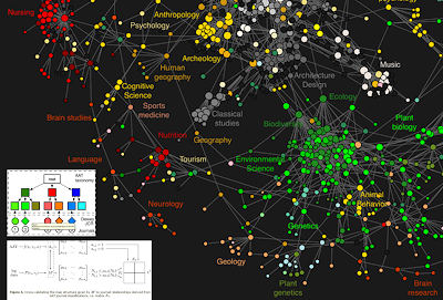
Full credits to the authors below, and brought to my attention by DirectionsMag.com - a fascinating visual diagram of scientific inter-relations by citation reference.
Quick "Cut & Paste" Highlights:
" ...Methodology:
Over the course of 2007 and 2008, [they] collected nearly 1 billion user interactions recorded by the scholarly web portals of some of the most significant publishers, aggregators and institutional consortia. The resulting reference data set covers a significant part of world-wide use of scholarly web portals in 2006, and provides a balanced coverage of the humanities, social sciences, and natural sciences. A journal clickstream model, i.e. a first-order Markov chain, was extracted from the sequences of user interactions in the logs. .... The resulting model was visualized as a journal network that outlines the relationships between various scientific domains and clarifies the connection of the social sciences and humanities to the natural sciences...."
References / Credits:
Johan Bollen1*, Herbert Van de Sompel1, Aric Hagberg2#, Luis Bettencourt2,3#, Ryan Chute1#, Marko A. Rodriguez2, Lyudmila Balakireva1
1 Digital Library Research and Prototyping Team, Research Library, Los Alamos National Laboratory, Los Alamos, New Mexico, United States of America, 2 Theoretical Division, Mathematical Modeling and Analysis Group, and Center for Nonlinear Studies, Los Alamos National Laboratory, Los Alamos, New Mexico, United States of America, 3 Santa Fe Institute, Santa Fe, New Mexico, United States of America
1 Digital Library Research and Prototyping Team, Research Library, Los Alamos National Laboratory, Los Alamos, New Mexico, United States of America, 2 Theoretical Division, Mathematical Modeling and Analysis Group, and Center for Nonlinear Studies, Los Alamos National Laboratory, Los Alamos, New Mexico, United States of America, 3 Santa Fe Institute, Santa Fe, New Mexico, United States of America
Citation: Bollen J, Van de Sompel H, Hagberg A, Bettencourt L, Chute R, et al. (2009) Clickstream Data Yields High-Resolution Maps of Science. PLoS ONE 4(3): e4803. doi:10.1371/journal.pone.0004803
Editor: Alan Ruttenberg, Science Commons, United States of America
Received: June 25, 2008; Accepted: February 6, 2009; Published: March 11, 2009
This is an open-access article distributed under the terms of the Creative Commons Public Domain declaration which stipulates that, once placed in the public domain, this work may be freely reproduced, distributed, transmitted, modified, built upon, or otherwise used by anyone for any lawful purpose.
This is an open-access article distributed under the terms of the Creative Commons Public Domain declaration which stipulates that, once placed in the public domain, this work may be freely reproduced, distributed, transmitted, modified, built upon, or otherwise used by anyone for any lawful purpose.
Funding: This research was funded as part of the MESUR project (http://www.mesur.org/) by the Andrew W. Mellon Foundation. The funders had no role in study design, data collection and analysis, decision to publish, or preparation of the manuscript.
Competing interests: The authors have declared that no competing interests exist.
Subscribe to:
Posts (Atom)