Continuing my own professional research series on ArcGIS Server applications, the below are some screenshots from the City of Frisco TX online resource center.
Nice interactive application with points of interest, city cervices, DEMs, traffic counts & flows, rel estate developments and digital imagery mixed in a public facing portal of spatial information.
Powered by Silverlight & ArcGIS Server - the legend details, searchable layers and address geocoding really make this a great public site.
This is the blog of a modern day Cartographer thrown into the business world. Over the course of my journeyman's career I have wandered through positions in government, news agencies, consulting corporations and rogue start ups. The hard-earned working theory I have developed is simple. In life, communication is hard work. In business, effective communication is critical. Hence, this blog parallels the location Intelligence practices on www.GeoSteppes.com.
Esri News Feed
Showing posts with label traffic. Show all posts
Monday, October 15, 2012
Sunday, May 02, 2010
Mapping Changes in Airspace - Volcanic Impact on European Air Traffic
I though this was a fascinating display of airspace and the recent Icelandic volcano's impact of European air traffic.
Airspace Rebooted from ItoWorld on Vimeo.
A quick "cut & paste" from the site:"... A visualisation of the northern European airspace returning to use after being closed due to volcanic ash. Due to varying ash density across Europe, the first flights can be seen in some areas on the 18th and by the 20th everywhere is open.
The flight data is courtesy of www.flightradar24.com and covers a large fraction of Europe. There are a few gaps (most noticeably France) and no coverage over the Atlantic, but the picture is still clear.
The map data is CC-by-SA www.openstreetmap.org and contributors.
This CC-by-SA visualisation was produced by www.itoworld.com with support from www.ideasintransit.org ..."
Airspace Rebooted from ItoWorld on Vimeo.
A quick "cut & paste" from the site:"... A visualisation of the northern European airspace returning to use after being closed due to volcanic ash. Due to varying ash density across Europe, the first flights can be seen in some areas on the 18th and by the 20th everywhere is open.
The flight data is courtesy of www.flightradar24.com and covers a large fraction of Europe. There are a few gaps (most noticeably France) and no coverage over the Atlantic, but the picture is still clear.
The map data is CC-by-SA www.openstreetmap.org and contributors.
This CC-by-SA visualisation was produced by www.itoworld.com with support from www.ideasintransit.org ..."
Friday, April 09, 2010
Map of Florida Area Roads and Traffic Growth
Florida Traffic Map - Map of Florida Area Roads and Traffic Growth
http://floridaroads.org/
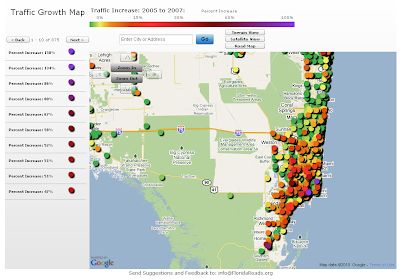
Found this site thru one of my GIS blog feeds. I would be curious to disect the data to look at differences in traffic congestion "off-season" and during the "snowbirds's arrival". The site allows for the standard "pan/zoom" or you and select by community/town of interest.
From the site:
"The Florida Traffic Growth Map highlights the busiest roads and highways. From 2005-2007, many roads and highways have seen at least a 50% increase in traffic. The map highlights the pace of change and increased utilization of Florida's infrastructure. In some areas the road conditions have changed significantly. The data is derived from the Florida Department of Transportation website. Each icon represents the location of a traffic counter and once clicked shows the annual average daily traffic (AADT) counts...."
http://floridaroads.org/
Found this site thru one of my GIS blog feeds. I would be curious to disect the data to look at differences in traffic congestion "off-season" and during the "snowbirds's arrival". The site allows for the standard "pan/zoom" or you and select by community/town of interest.
From the site:
"The Florida Traffic Growth Map highlights the busiest roads and highways. From 2005-2007, many roads and highways have seen at least a 50% increase in traffic. The map highlights the pace of change and increased utilization of Florida's infrastructure. In some areas the road conditions have changed significantly. The data is derived from the Florida Department of Transportation website. Each icon represents the location of a traffic counter and once clicked shows the annual average daily traffic (AADT) counts...."
Labels:
drive-time,
Florida,
google map,
maps,
mash-ups,
traffic
Subscribe to:
Posts (Atom)

