For all of you not familiar with "Death and Taxes", this is a site that produces an interactive graphical display (posters also available) now three years running of the federal budget. It contains over 500 programs and departments and almost every program that receives over 200 million dollars annually. The data is straight from the president's 2010 budget request and will be debated, amended, and approved by Congress to begin the fiscal year. All of the item circles are proportional in size to their spending totals and the percentage change from 2009 is included to spot trends and disproportion.
Its a great way to compare NASA to the NSA, Homeland Security to Healthcare, etc. - from a budget expenditure perspective.
This is the blog of a modern day Cartographer thrown into the business world. Over the course of my journeyman's career I have wandered through positions in government, news agencies, consulting corporations and rogue start ups. The hard-earned working theory I have developed is simple. In life, communication is hard work. In business, effective communication is critical. Hence, this blog parallels the location Intelligence practices on www.GeoSteppes.com.
Esri News Feed
Thursday, July 30, 2009
Just Released - Death & Taxes 2010
Labels:
budget,
Death and Taxes,
government,
politics
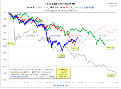
A Story of Four Bad Bears ....
 As the story goes, Goldilocks never met bears like these.... a historical comparison of four "bad bear markets"; the Dow Crash of 1929, the Oil Crisis in 1973, the Tech Crash of 2000 and the current recession.
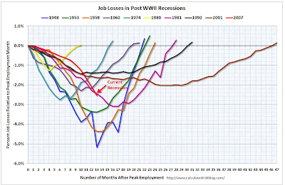
I found this on DShort.com , there is also a great job loss comparison with four different looks at the recession from Flowing Data .
Again, the graphical display over time seem most relevant in communicating financial turmoil.
The second image is from Calculated Risk as of the February job loss numbers. One can imagine with the huge hemorrhaging of jobs in the last six months our "line" has sunk quite a bit further.

Labels:
bear markets,
Calculated Risk Blog,
DShort.com,
economy,
flowingdata,
jobs,
recession
Tuesday, July 28, 2009
Another $800 Billion visual perspective

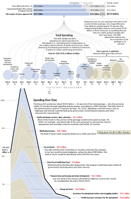
As I continued to research, I came across another more detailed visual portrayal of the economic stimulus plan.
This one has a better temporal dynamic on the axis showing the impact over time from fiscal year 2009 thru 2019.
In particular, the large numbers from Medicaid provisions, state fiscal stabilization and health insurance for the unemployed are now "top of mind" political topics in their own right.
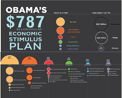
The Obama Stimulus Plan - A Visual Refresher
 As funny as it sounds in today's economic times, I need a refresher on where the $800 billion stimulus plan went .... So I dug up some visual displays of Obama's economic plan.
This particular collage comes from InfoGraphics - as first seen on FlowingData
You would think after only six months of spending this type of cash each 100 million would be etched into our brains, but alas .... even nearly a trillion is but a fleeting memory.
I was mostly interested in reviewing the ratio of tax cuts to aid to local/state governments given the State of California's recent budget debacle.
As always, the visual provides some clarity (at least as to the categories of spend) on how to interpret the data.
Labels:
Barak Obama,
economic stimulus,
flowingdata,
infographics,
politics
Thursday, July 23, 2009
Cool Geo-Pic: Eclipse - Prophesy or Shadow? Depends on your point of view.

This Cool Geo-Pic comes again from NASA's Earth Observatory. While I've seen some wonderful eclipse images, this is the first that's from the "moon"s point of view".
Funny how a prophetic event to one, is just a shadow to another. Makes me wonder what an ant dreams up when he encounters my "looming darkness" on a sunny Sunday sidewalk stroll. Eghads! It blocks out the sun!
Another example that all things are relative to your point of view.
Quick "Cut & Paste" Highlights:
" ... The Moon’s shadow engulfed Taiwan and a large swath of southeastern China and the Pacific Ocean on the morning of July 22, 2009, during an unusually long total eclipse of the Sun. This pair of images from the Japanese geostationary satellite MTSAT show the view of Earth at 8:30 a.m. local time in Taiwan (left) and an hour later (right), near the time in eastern China when the disk of the Moon completely overlapped the disk of the Sun (called totality). The longest period of totality occurred over the Pacific, where the total eclipse lasted more than 6 minutes...."
download large 8:30 image image (90 KB, JPEG) acquired July 22, 2009
download large 9:30 image image (94 KB, JPEG) acquired July 22, 2009
Exploratorium.edu. (n.d.) Total Solar Eclipse, July 22, 2009. Accessed July 22, 2009.
U.S. Naval Observatory. (n.d.) The Sky This Week, 2009 July 17 – 24. Accessed July 22, 2009.
Espenak, F. (n.d.) Total Solar Eclipse of 2009 July 22. NASA Eclipse Website. Accessed July 22, 2009.
Images provided by WebGMS–MTSAT/GMS (HIMAWARI) Website, Institute of Industrial Science & Earthquake Research Institute, University of Tokyo, Japan.
Instrument:
MTSAT
Saturday, July 04, 2009
Cool Geo-Pic: Atlantic Ocean Temperatures

This Cool Geo-Pic comes again from NASA's Earth Observatory. Given my daughter was born between to hurricance passes, this is always something on interest to us "New Floridians".
Quick "Cut & Paste" Highlights:
" ...The first month of the 2009 Atlantic hurricane season drew to a close without so much as a tropical storm, but that isn’t unusual. According to the National Hurricane Center, the 1944-2002 average for named storms in June was only about 0.75, which means they don't occur every year. When they do form, it is usually the Gulf of Mexico that brews them up, and this image of sea surface temperatures on June 30, 2009, shows why...."
Full Article - Click Here
References / Credits:
National Hurricane Center. Tropical Cyclone Climatology. Accessed July 1, 2009.
NASA image by Jesse Allen and Robert Simmon. Caption by Rebecca Lindsey.
Instrument:
Aqua - MODIS
NASA image by Jesse Allen and Robert Simmon. Caption by Rebecca Lindsey.
Instrument:
Aqua - MODIS
Cool Geo-Pic: Fire Season in a Rain Forest

This Cool Geo-Pic comes again from NASA's Earth Observatory. What can create a fire season in a rain forest? Us, of course.
Quick "Cut & Paste" Highlights:
" ...Prior to widespread human settlement and forest clearing, there was no such thing as a fire season in the Amazon Rainforest. The ability of trees to draw water up from deep underground during the annual dry season and a lack of natural fire triggers—lightning rarely occurs without rain—meant that in most places, a fire might occur once in several hundred—or perhaps as many as 1,000—years. Today, burning begins in August, generally peaks in September, and tapers off by October; during these months, the skies over the Amazon fill with smoke ......"
"..... Scientists use the amount of smoke and fires in the Amazon as an indicator of how much of the Amazon was cleared or degraded each year, but the burning has other impacts. Fires release large amounts of carbon dioxide into the atmosphere, adding to global warming. And the smoke chokes off cloud formation, which changes the Amazon’s energy balance: fewer clouds mean more sunlight reaches the surface, which leads to warming."
Full Article - Click Here
References / Credits:
Full Article - Click Here
References / Credits:
Koren, I., Remer, L., and Longo, K. (2007). Reversal of trend of biomass burning in the Amazon. Geophysical Research Letters,34, L20404, doi:10.1029/2007GL031530.
Lindsey, R. (2004). From Forest to Field: How Fire is Transforming the Amazon. NASA’s Earth Observatory. Accessed June 29, 2009.
Lindsey, R. (2008). Amazon Fires on the Rise. NASA’s Earth Observatory. Accessed June 29, 2009.
Torres, O. . Chen, Z., Jethva, H., Ahn, C., Freitas, S.R., and Bhartia, P.K. (2009). OMI Observations of the Anomalous 2008 Southern Hemisphere Biomass Burning Season. Manuscript submitted for publication.
NASA image created by Jesse Allen, based on OMI aerosol data provided by Omar Torres and Changwoo Ahn (Hampton University). Caption by Rebecca Lindsey.
Instrument:
Aura - OMI
Subscribe to:
Comments (Atom)