Recently made the move from Esri to Deloitte Geospatial. While I will always be an advocate of the Esri platform, the "brand independence" has given me the opportunity to broaden the consideration of WebGIS tools to be truly "platform agnostic". Recently we've been tooling around with CartoDB - here are some of my favorite samples - blending a live
twitter feed with WebGIS.
NASA EOSDIS GIBS, CartoDB attribution
pause
21:52
Sunrise around the world - Geotagged Tweets mentioning 'sunrise' in different languages, April 6, 2014, GMT
Embed this map
Wednesday, September 23, 2015


Friday, March 06, 2015
Cool Geo-Video: Mapping Dust from the Sahara to the Amazon
Cool Geo-Pics from NASA's Earth Observatory.
Quick "Cut & Paste":
"....Hundreds of millions of tons of sand and dust particles are lifted from North African deserts each year and carried across the Atlantic Ocean. So much dust is kicked up that the microscopic particles amass into sweeping tan plumes that are visible to satellites......"
"....The data show that wind and weather pick up on average 182 million tons of dust each year and carry it past the western edge of the Sahara. The dust then travels 1,600 miles across the Atlantic Ocean, though some drops to the surface or is flushed from the sky by rain. Near the eastern coast of South America, 132 million tons remain in the air and 27.7 million tons fall to the surface over the Amazon basin....."
References:
Quick "Cut & Paste":
"....Hundreds of millions of tons of sand and dust particles are lifted from North African deserts each year and carried across the Atlantic Ocean. So much dust is kicked up that the microscopic particles amass into sweeping tan plumes that are visible to satellites......"
"....The data show that wind and weather pick up on average 182 million tons of dust each year and carry it past the western edge of the Sahara. The dust then travels 1,600 miles across the Atlantic Ocean, though some drops to the surface or is flushed from the sky by rain. Near the eastern coast of South America, 132 million tons remain in the air and 27.7 million tons fall to the surface over the Amazon basin....."
References:
- Barcelona Dust Forecast Center (2105, March 2) Dusty February in the Middle East. Accessed March 2, 2015.
- NASA (2015, February 24) NASA Satellite Reveals How Much Saharan Dust Feeds Amazon’s Plants. Accessed March 2, 2015.
- NASA Earth Observatory (2013, August 29) Tracking Dust Across the Atlantic.
- NASA Earth Observatory (2014, July 5) Saharan Dust on the Move.
NASA Earth Observatory images by Jesse Allen, using Aqua and Terra MODIS data from the Land Atmosphere Near real-time Capability for EOS (LANCE), and the University of Wisconsin’s Space Science and Engineering Center for Suomi National Polar-orbiting Partnership data from the VIIRS instrument. Suomi NPP is the result of a partnership between NASA, the National Oceanic and Atmospheric Administration, and the Department of Defense. Caption by Michael Carlowicz and Ellen Gray, with image interpretation from Lorraine Remer, Santiago Gassó, and Ralph Kahn.
- Instrument(s):
- Terra - MODIS
- Aqua - MODIS
- Suomi NPP - VIIRS
Wednesday, February 25, 2015
Cool Geo-video: Mapping Mega-Droughts
This cool geo-video comes from NASA science in an effort to communicate drought risk base on past drought & soil moisture to drive climate modeling scenarios to estimate the risk & impact of future drought in the 21st century.
Reference: NASA Earrh Observatory, Carbon Emissions Could Dramatically Increase Risk of U.S. Megadroughts, February 15, 2015 - original post - click here
Reference: NASA Earrh Observatory, Carbon Emissions Could Dramatically Increase Risk of U.S. Megadroughts, February 15, 2015 - original post - click here
- NASA Earth Observatory (2012, February 1) Mayan Deforestation and Drought.
- NASA Earth Observatory (2010, June 3) Global Warming.
- NASA Earth Observatory (2010, October 1) The Water Cycle.
- NASA Earth Observatory (2012, September 12) The Gravity of Water.
NASA images by Greg Shirah (NASA/GSFC) and Cheng Zhang (USRA), NASA Scientific Visualization Studio. Caption by Patrick Lynch, NASA Earth Science News Team.
- Instrument(s): Model
Cool Geo-Pic: "Net-net" Global Sea Ice is Shrinking
Today's cool geo-pic is again from NASA's Earth Observatory. It provides a "net-net" comparison of polar ice loss, and comes to the conclusion that global sea ice is still shrinking.
"Cut & Paste" Highlights:
"....Examining 35 years of sea ice data, Parkinson has shown that increases around Antarctica do not make up for the accelerated Arctic sea ice loss of the last decades. Earth has been shedding sea ice at an average annual rate of 35,000 square kilometers (13,500 square miles) since 1979—the equivalent of losing an area of sea ice larger than the state of Maryland every year...."

.... “Even though Antarctic sea ice reached a new record maximum in September 2014, global sea ice is still decreasing,” said Parkinson, who is based at NASA’s Goddard Space Flight Center. “That’s because the decreases in Arctic sea ice far exceed the increases in Antarctic sea ice.....”
".....The line graphs above plot the monthly deviations and overall trends in polar sea ice from 1979 to 2013 as measured by satellites. The top line shows the Arctic, the middle shows Antarctica, and the third line shows the global, combined total. The sparklines at the bottom of the graphs show each year separately, enabling month-to-month comparisons across each year. The thickness of each sparkline indicates the overall growth or loss in sea ice globally. The thinning of the sparklines is indicative of the downward trend in total polar sea ice......"

Full Article: Despite Antarctic Gains, Global Sea Ice Is Shrinking February 11, 2015
Click Here
References:
"Cut & Paste" Highlights:
"....Examining 35 years of sea ice data, Parkinson has shown that increases around Antarctica do not make up for the accelerated Arctic sea ice loss of the last decades. Earth has been shedding sea ice at an average annual rate of 35,000 square kilometers (13,500 square miles) since 1979—the equivalent of losing an area of sea ice larger than the state of Maryland every year...."
.... “Even though Antarctic sea ice reached a new record maximum in September 2014, global sea ice is still decreasing,” said Parkinson, who is based at NASA’s Goddard Space Flight Center. “That’s because the decreases in Arctic sea ice far exceed the increases in Antarctic sea ice.....”
".....The line graphs above plot the monthly deviations and overall trends in polar sea ice from 1979 to 2013 as measured by satellites. The top line shows the Arctic, the middle shows Antarctica, and the third line shows the global, combined total. The sparklines at the bottom of the graphs show each year separately, enabling month-to-month comparisons across each year. The thickness of each sparkline indicates the overall growth or loss in sea ice globally. The thinning of the sparklines is indicative of the downward trend in total polar sea ice......"
Full Article: Despite Antarctic Gains, Global Sea Ice Is Shrinking February 11, 2015
Click Here
References:
- Parkinson, C.L. (2014) Global Sea Ice Coverage from Satellite Data: Annual Cycle and 35-Yr Trends. Journal of Climate, 27, 9377–9382.
- NASA Earth Observatory (2014, September 24) A Tale of Two Poles.
- NASA Earth Observatory (2014) Antarctic Sea Ice.
- NASA Earth Observatory (2014) Arctic Sea Ice.
- NASA Earth Observatory (2009, April 20) Sea Ice.
Earth Observatory images by Joshua Stevens. Caption by Maria-Jose Viñas and Mike Carlowicz.
- Instrument(s): DMSP - SSM/I
Tuesday, February 24, 2015
Cool Geo-Video: Mapping Greenland's Ice Sheets
Very cool video showing ice layers from three periods (Holocene, last Ice Age & Eemian) covering 150,000 years of accumulation.
Friday, February 20, 2015
Geo in BI: Embedding ArcGIS into MicroStrategy
Video from the Esri files, a good overview of how to embed GIS into BI.
Location Architect simplifies map creation in MicroStrategy
Location Architect simplifies map creation in MicroStrategy
Location Architect in Esri Maps for MicroStrategy 2.0 allows organizations to define geographic relationships in their MicroStrategy data, and a corporate style for maps at the project level. A Location Architect model simplifies map creation in MicroStrategy, automatically updates maps to reflect changes in the report grid, and applies consistent mapping styles for attributes and metrics across your MicroStrategy project.
Thursday, September 11, 2014
Cool Geo-Pic: Mapping Internet Attacks
This image and hyperlink comes from Norse to highlight there Dark Matter platform.
Per the company's website - " .... The patented Norse DarkMatter platform is a globally-distributed "distant early warning" network of thousands of sensors, honeypots, and crawlers that continuously analyzes Internet traffic to identify compromised hosts, malicious botnets, anonymous proxies, and other sources of digital attack. Processing hundreds of terabytes daily, the DarkMatter™ attack intelligence platform continuously computes over 1,500 distinct risk factors for millions of IP addresses every day...."
Good stuff, but the visualization really brings it to life. It immediately reminds us of a global thermonuclear warfare simulation a-la internet attacks.

Definitely check out Norse - IP Viking-Live
Per the company's website - " .... The patented Norse DarkMatter platform is a globally-distributed "distant early warning" network of thousands of sensors, honeypots, and crawlers that continuously analyzes Internet traffic to identify compromised hosts, malicious botnets, anonymous proxies, and other sources of digital attack. Processing hundreds of terabytes daily, the DarkMatter™ attack intelligence platform continuously computes over 1,500 distinct risk factors for millions of IP addresses every day...."
Good stuff, but the visualization really brings it to life. It immediately reminds us of a global thermonuclear warfare simulation a-la internet attacks.
Definitely check out Norse - IP Viking-Live
Monday, September 08, 2014
Cool Geo-Video: Earth's Magnetic Field
Source: NASA's Earth Observatory
Quick "Cut & Paste" Summary:

"....Launched in November 2013 by the European Space Agency (ESA), the three-satellite Swarm constellation is providing new insights into the workings of Earth’s global magnetic field. Generated by the motion of molten iron in Earth’s core, the magnetic field protects our planet from cosmic radiation and from the charged particles emitted by our Sun. It also provides the basis for navigation with a compass...."
" ....Geophysicists have noted that the strength of Earth’s magnetic field has been decaying—about 5 percent globally over the past century. However, it is not changing in a uniform way; it grows growing stronger in some places and weaker in others. ...."
"....[t]he changes are a natural variation due to processes in the deep interior of the Earth ....[t] he movement of molten iron in the core creates electric currents, and electric currents create a magnetic field. So every change in the flow of the core means changes in the magnetic field...."
Credits & References:
- European Space Agency (2014, June 19) Swarm Reveals Earth’s Changing Magnetism. Accessed September 5, 2014.
- NASA Earth Observatory (2011, April 23) Earth’s Magnetosphere.
- NASA Earth Observatory (2004, May 22) Earth’s Surface Magnetism.
- NASA Earth Observatory (2004, March 30) Gravity Recovery and Climate Experiment.
Images and video courtesy of European Space Agency/Technical University of Denmark (ESA/DTU Space). Caption by Mike Carlowicz, based in part on a story from the European Space Agency.
Thursday, August 21, 2014
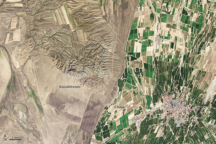
Cool Geo-Pic: Border Result of Different Agricultural Use
Found the cool geo-pic from the familiar NASA Earth Observatory. Fascinating how the different demands & policies for agricultural land use can produce such a stark contrast.
Geo-Pic:
Quick "Cut & Paste" Description:
"....The border between the two countries is defined by land-use policies. In China, land use is intense. Only 11.62 percent of China’s land is arable. Pressed by a need to produce food for 1.3 billion people, China farms just about any land that can be sustained for agriculture. Fields are dark green in contrast to the surrounding arid landscape, a sign that the agriculture is irrigated. As of 2006, about 65 percent of China’s fresh water was used for agriculture, irrigating 629,000 square kilometers (243,000 square miles) of farmland, an area slightly smaller than the state of Texas....."
".....The story is quite different in Kazakhstan. Here, large industrial-sized farms dominate, an artifact of Soviet-era agriculture. While agriculture is an important sector in the Kazakh economy, eastern Kazakhstan is a minor growing area. Only 0.03 percent of Kazakhstan’s land is devoted to permanent agriculture, with 20,660 square kilometers being irrigated....."
Credits: Source link
Geo-Pic:
Quick "Cut & Paste" Description:
"....The border between the two countries is defined by land-use policies. In China, land use is intense. Only 11.62 percent of China’s land is arable. Pressed by a need to produce food for 1.3 billion people, China farms just about any land that can be sustained for agriculture. Fields are dark green in contrast to the surrounding arid landscape, a sign that the agriculture is irrigated. As of 2006, about 65 percent of China’s fresh water was used for agriculture, irrigating 629,000 square kilometers (243,000 square miles) of farmland, an area slightly smaller than the state of Texas....."
".....The story is quite different in Kazakhstan. Here, large industrial-sized farms dominate, an artifact of Soviet-era agriculture. While agriculture is an important sector in the Kazakh economy, eastern Kazakhstan is a minor growing area. Only 0.03 percent of Kazakhstan’s land is devoted to permanent agriculture, with 20,660 square kilometers being irrigated....."
Credits: Source link
- BBC News (2010, January 30) Kazakhs protest against China farmland lease. Accessed July 9, 2014.
- Earth Observatory (2013, September 25) Fall harvest in Kazakhstan. Accessed July 9, 2014.
- Encyclopedia of Earth (2013, August 25) Land use profile of China. Accessed July 9, 2014.
- Fragile Oasis (2011, September 7) Borders from space. Accessed July 9, 2014.
- United States Central Intelligence Agency (2014, June 22) The world factbook: China. Accessed July 9, 2014.
- United States Central Intelligence Agency (2014, June 22) The world factbook: Kazakhstan. Accessed July 9, 2014.
NASA Earth Observatory image by Robert Simmon, using Landsat data from the U.S. Geological Survey. Caption by Holli Riebeek.
- Instrument(s): Landsat 8 - OLI
Subscribe to:
Posts (Atom)