This is the blog of a modern day Cartographer thrown into the business world. Over the course of my journeyman's career I have wandered through positions in government, news agencies, consulting corporations and rogue start ups. The hard-earned working theory I have developed is simple. In life, communication is hard work. In business, effective communication is critical. Hence, this blog parallels the location Intelligence practices on www.GeoSteppes.com.
Esri News Feed
Monday, August 31, 2009
We are ... PENN STATE
Blue & white forever.
Labels:
Penn State
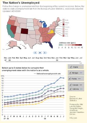
National Unemployment - Interactive Map

This came to my attention from The Map Room, MapHawk and others.
I used the interactive state selection to map 5 states of personal interest, looking at there comparative change in unemployment. This line graph illustrates California, Colorado, Florida, Michigan & Virginia.
I used the interactive state selection to map 5 states of personal interest, looking at there comparative change in unemployment. This line graph illustrates California, Colorado, Florida, Michigan & Virginia.
Data Source: Bureau of Labor Statistics
Full credits to: Mel Lan-Ho Walker, Susan McGregor, Ana Rivas, Jennifer Valentino-DeVies at WSJ.com
Labels:
maps,
unemployment
Subscribe to:
Comments (Atom)