Esri News Feed

Friday, June 19, 2009

Air France Flight 447 - Google Earth Map


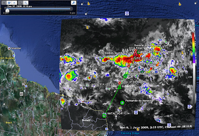
I found this Google Earth flight path representation of Air France Flight 447.


My wife is a Flight Attendant & I had a "start-up career deviation" in aviation, so I'm a biased source.

Please check out this one by 'rafaelds
overlay of a weather map at the time of the crash

I'm not going to comment on this one, other than to offer my condolences to the crew & passenger families - and recognize that "aviation people" are some of the best folk I have ever met & had the pleasure to work with....
If you seek more info - View article...

Monday, June 15, 2009

Mapping Twitter - Present & Future

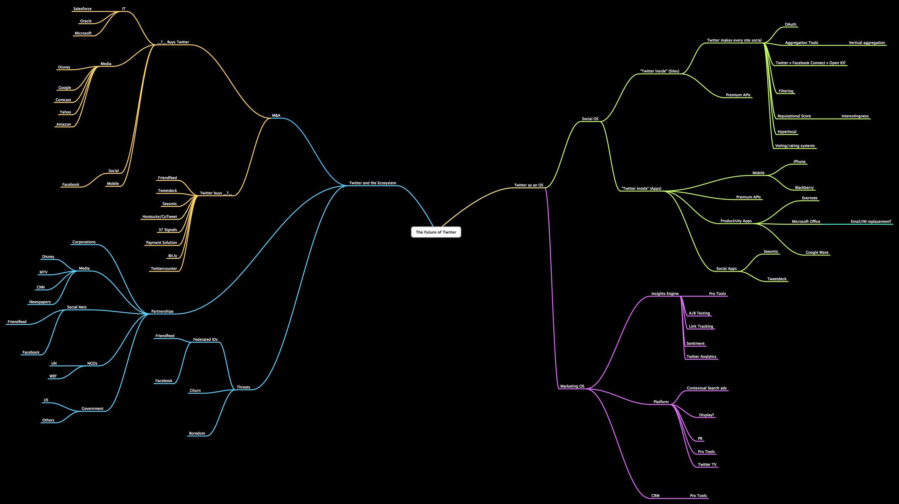
As far as Twitter is concerned, I still consider myself a "well-informed Luddite". With that said, from those that know, below is a visual mapping juxtaposing Twitter's presence reach to it's branching future. Full links describe both.


Per Flowing Data, " ... The below flow chart from Steve Rubel shows Twitter's possible future while the above from Brian Solis and Jess3 shows all the spawns of Twitter data.,...".

I've just "halved" the images for easy display. Welcome to the TwitterVerse? Perhaps .....


Monday, June 01, 2009

A Link Worth Watching: Where 09: "Decoding the Urban DNA and Harnessing the Power of Social Intelligence"


From
Sense Networks at the the O'Reilly Where '09 conference - the data driven analysis to incorporate the variety of social interactions and activities in a certain locale - as they vary by "time of day" and "day of week" dimensions - made this a really fascinating presentation.

Full credits to Sense Networks CEO:
"
Mr. Skibiski is Chairman and Chief Executive Officer of Sense Networks. He is responsible for the company’s overall strategic vision in the financial and consumer services markets...."

Full credits to O'Reilly where 2.0:
" Now in its fifth year, the Where 2.0 Conference is where the grassroots and leading edge developers building location aware technology intersect with the businesses and entrepreneurs seeking out location apps, platforms, and hardware to gain a competitive edge. In the O'Reilly conference tradition, Where 2.0 presents leading trends rather than chasing them...."

Thursday, May 28, 2009

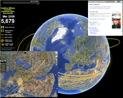
A Map for Memorial Day - Sobering remembrance

I spent the Memorial Weekend in the Washington DC area. We celebrated my son's 8th birthday, toured the Air & Space Museum, and heard the roar of the Rolling Thunder bikers as they massed on the mall for remembrance of our soldiers' sacrifice.

This particular site (
www.MapTheFallen.org) seemed to capture my mixed emotions on the two wars and the sacrifice born by our military. I wish I could bring them all back, and hope this site continues to geographically illustrate their deeds, and emphasize the eternal thanks we owe them all.

In the Google Earth environment, you are able to see home of record, approximate place of death, and other thematic/temporal representations.


Saturday, May 16, 2009

Visualizing the US Alternative Power vs. Current Grid


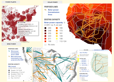
This visualization of the current national power grid and comparisons of several alternative energy "landscapes" (Solar, Wind, etc.) is an intriguing comparison of current power network to potential new sources of energy in an environment of ever increasing "power-hungry" demand.


Quick "Cut & Paste" highlights:


The nation’s electricity grid is facing a crisis -- it’s outdated and unprepared for increasing demand and a future that includes more renewable sources of energy. A new digital smart grid is part of the picture envisioned by advocates, as is building new electricity infrastructure.


Credits:

To Flowing Data for bringing it to my attention, and these NPR folk (below) for putting it together:


Sources: American Electric Power, American Wind Energy Association, Center for American Progress, Department of Energy, Edison Electric Institute, Energy Information Administration, Electric Power Research Institute, Federal Energy Regulatory Commission, National Renewable Energy Laboratory, U.S. Environmental Protection Agency, Western Resource Advocates
Credits: Producer: Andrew Prince; Designer: Alyson Hurt; Editors: Avie Schneider and Vikki Valentine; Supervising Editors: Anne Gudenkauf and Quinn O'Toole; Additional Research: Jenny Gold; Database and GIS Analysis: Robert Benincasa

Tuesday, May 12, 2009

When I Finally Go .... I want to be a Drop in the Ocean


I saw this on BBC and thought ..."Yup, that's a neat way to go into the Great Beyond".

Thursday, April 30, 2009

The World's Largest Populations Require Glacier Melt for Water Flow - a Map Display


This Cool Map comes from the UNEP/GRID Maps Library. What seems most telling, is that 3 billion+ people rely on glacier melt water flow for their basic water requirements. This is the most stark example I have have seen on the "inland" impact from climate change.

Quick "Cut & Paste" Highlights:

" ...Many of the largest rivers in the Himalayas Hindu Kush region are strongly dependent upon snow and glacial melt for waterflow. Many of the largest rivers in the Himalayas Hindu Kush region are strongly dependent upon snow and glacial melt for waterflow. Except for the fact that glaciers are melting rapidly in many places, we do not have adequate data to more accurately project when and where water scarcity will affect irrigation schemes in full. Making accurate projections is also difficult because of variations in the effects on ground and surface water, as well as on water for urban needs and industrial purposes Furthermore, the cost of water may also increase, seriously complicating the water scarcity question. Recent studies show that cost of water has increased by about 400–500% since 1990 in the Indo-Gangetic Basin of India..."

Full Article - Click Here

Download this graphic in png format, 1812 KB , suitable for web-sites, documents or presentations.
Download this graphic in tif format, 4501 KB, suitable for print and editing.
Download this graphic in jpg format, 1242 KB , suitable for web-sites, documents or presentations.

References / Credits:
(Source: Rees and Collins, 2004; UNEP, 2007).
Link to web-site
http://www.grida.no/publications/rr/food-crisis/
Cartographer/Designer Ieva Rucevska, UNEP/GRID-Arendal
Appears in
Environmental Food Crisis
Published 2009, Joel Benoit

Wednesday, April 29, 2009

Mapping Trends in Employment - a Visual Comparison by Year


This interactive map display pits the temporal display of thematic data; i.e. Mapping Trends in Employment - a Visual Comparison by Year.

Full credits to:
An interactive map of vanishing employment across the country. - By Chris Wilson - Slate Magazine.

Tuesday, April 28, 2009

Cool Geo-Pic: Amount of Old Ice in Arctic Hits Record Low in February 2009


This Cool Geo-Pic comes again from NASA's Earth Observatory. While the loss of perennial sea ice opens trade routes, its seems a pale trade-off given the global impact of climate change, sea level rise and the more imaginative tales of polar shift.


Quick "Cut & Paste" Highlights:


" ...The summer minimum and the winter maximum are the two pivotal milestones in the annual cycle of Arctic sea ice. The thickness of sea ice and the extent at each of these times are key indicators of Arctic climate. Over the past two and a half decades, the extent of sea ice at the end of summer (mid-September) has declined significantly. The corollary to that trend is that at the winter maximum (end of February or mid-March), the ice covering the Arctic is much younger and thinner than it was in the past...."


"...The age of ice in the winter pack is important because young ice is thin and likely to melt in the upcoming summer. Historically, a large “core” of sea ice survived the summer. Around the margins of the perennial ice, new ice forms each winter and melts each summer. Ice that survives the summer melt thickens and hardens through freezing of new water and collisions with other ice floes, which builds thick ridges of ice....."

Full Article - Click Here

References / Credits:


Maslanik, J., Fowler, C., Stroeve, J., Drobot, S., Zwally, J., Yi, D., and Emery, W. (2007). A younger, thinner Arctic ice cover: Increased potential for rapid, extensive sea-ice loss. Geophysical Research Letters, 34, L24501.
National Snow and Ice Data Center.
Arctic Sea Ice News & Analysis. NSIDC Website. Accessed April 8, 2009.

Further Reading:
NASA satellites show Arctic literally on thin ice.
Dwindling Arctic Ice.
NASA images by Jesse Allen, based on data provided by James Maslanik and Chuck Fowler, University of Colorado and NSIDC. Caption by Rebecca Lindsey, with input provided by Walt Meier, NSIDC.
Instrument:
DMSP

Saturday, April 18, 2009

LA vs. NY - the Geography of Buzz - Cultural Mapping


A great comparison display of the geography of media - first brought to my attention by
Flowing Data - it continues the rivalry of two American centers of culture.

Quick "Cut & Paste" Highlights:
" ...Elizabeth Currid (USC) and Sarah Williams (Columbia University), collaborate to map the
geography of buzz ..... mined thousands of photos from Getty Images which provided a dataset of parties in art, music, fashion, movies, film, etc and created density maps which in turn show the hip places to be...."


Full Article - Click Here

References / Credits:
FlowingData RSS feed , NY Times