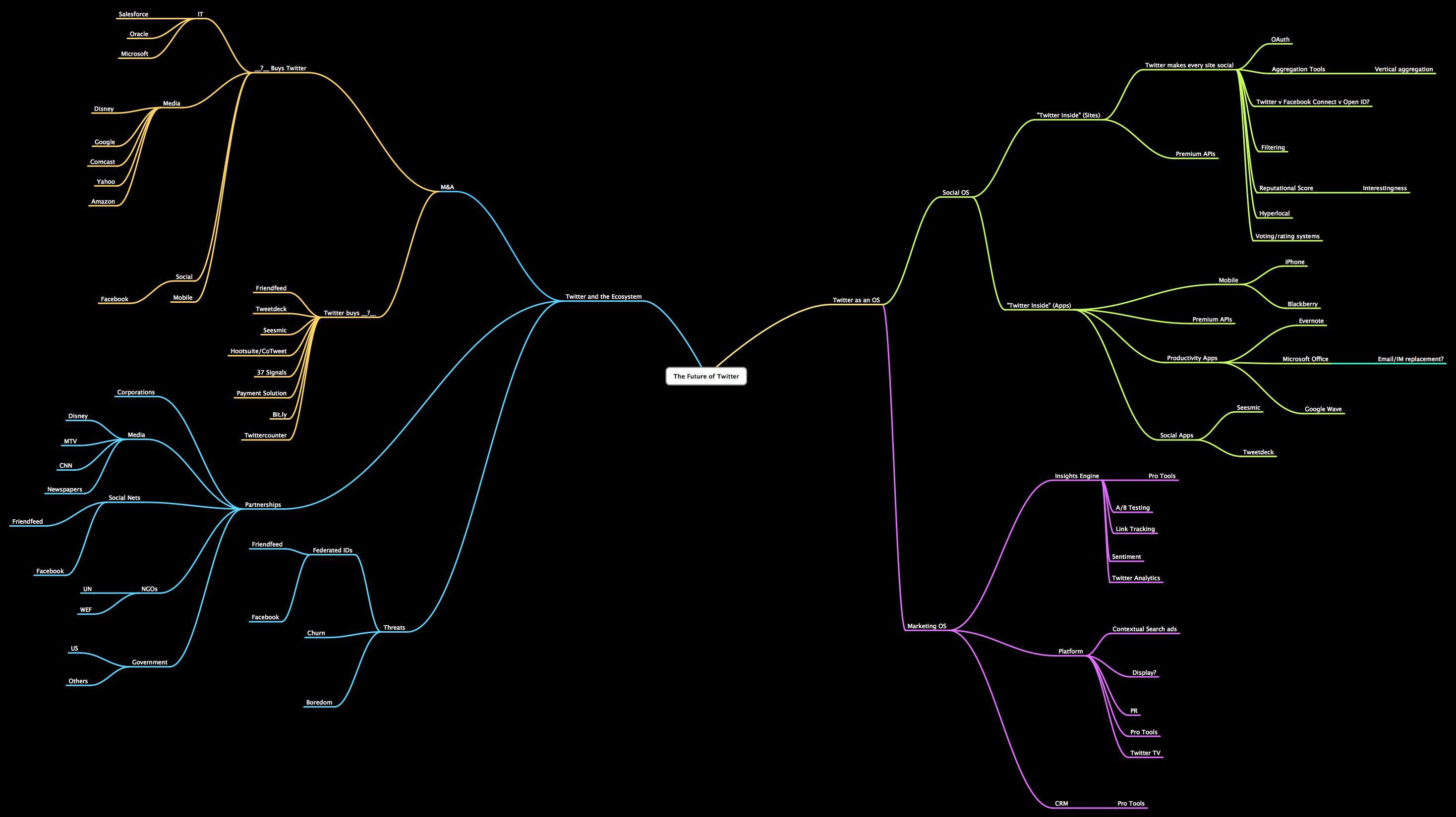
 As far as Twitter is concerned, I still consider myself a "well-informed Luddite". With that said, from those that know, below is a visual mapping juxtaposing Twitter's presence reach to it's branching future. Full links describe both.
Per Flowing Data, " ... The below flow chart from Steve Rubel shows Twitter's possible future while the above from Brian Solis and Jess3 shows all the spawns of Twitter data.,...".
I've just "halved" the images for easy display. Welcome to the TwitterVerse? Perhaps .....
No comments:
Post a Comment