Esri News Feed

Showing posts with label flowingdata. Show all posts

Friday, February 10, 2012

Mapping Dance Moves - Step By Step for Pulp Fiction & Napoleon Dynamite

Found this one from FlowingData, made me think of Maroon 5's recent song "Moves like Jagger". If you want to take on some "cult classic" moves from Pulp Fiction and Napoleon Dynamite ... read on.


Full credits to Niege Borges - buy his prints here.
 

Wednesday, August 10, 2011

Mapping Migration - a Visualization of Inflow & Outflows by Nation

As the election season matures and the Census decennial data slowing "leaks" out, there has been a lot of focus on America's changing demographics.  Below is a neat site that visualizes the migration inflow & outflows by nation.

Here is a screenshot (from peoplemov) of the US migration inflows, interesting how the drop off in count is dramatic after the Mexico-USA corridor is tabulated (oceans will do that to migration...).


"Cut & Paste" Highlights from peoplemovin:

"...the flows of migrants as of 2010 through the use of open data (see Data Sources below).... are presented as a flow chart that shows the connections between countries. The chart is split in two columns, the emigration countries on the left and the destination countries on the right ... [t]he thickness of the lines connecting the countries represents the amount of immigrated people. ..."

This isn't exclusively limited to US data.  The "world's top migration corridor" list makes me "muse" a bit.  It's fascinating where the BRIC nations (Brazil, Russia, India, and China) are "moving to".

Migration Data:
The World Bank Open Data
Bilateral Migration and Remittances 2010
Refugees and Asylum
 
Data Sources - All the presented data are the latest available as of 2010.

peoplemovin is an experimental project in data visualization by Carlo Zapponi. Credits also go to FlowingData for bringing this site to my attention.

Friday, March 04, 2011

Mapping Android Usage - Activations by Continent

Interesting given all the recent press around "Apple-nation" - never count "the 'Droid" out.
Still no GSM for Apple iPhone on Verizon (aarrgghh).
Credits to FlowingData for bringing this to my attention.


Friday, September 03, 2010

Moving out of New York (and into): The Visualization of Where

Found this  - a wonderful interactive visual display of New York migration patterns by zip code.  Really at its base, there are two key bits of information driving this map - where to & from by zip.


Taking a "dot cartogram" approach, I like to the "in-out" color thematics and inter route line connections to origin and destination zip codes.


This was part of 15 data "interpretations" featured on FlowingData and WNYC. Read/view more on the other submission below.


From WNYC.org's Map Your Moves: Data Visualization Challenge Submissions


Full credits to Moritz Stefaner (moritz.stefaner.eu)  - great work! Also thanks to FlowingData Mapping the moves of New York residents for bringing this to my attention.

Tuesday, August 17, 2010

Interactive Street Level Mapping a View of StreetSlide


This is an intriguing evolution of how to interact with street level imagery. Rather than a panoramic experience, this is a bit more like "drive-by window-shopping". Apparently the official term for this is "multi perspective strip panoramas".


A quick "Cut & Paste" Highlight:


" ... Street Slide ... combines the best aspects of the immersive nature of bubbles with the overview provided by multi perspective strip panoramas. ... a seamless transition between bubbles and multi-perspective panoramas. .... As the user slides sideways, the multi-perspective panorama is constructed and rendered dynamically to simulate either a perspective or hyper-perspective view. This provides a strong sense of parallax, which adds to the immersion. ... [f]inally we integrate annotations and a mini-map within the user interface to provide geographic information as well additional affordances for navigation...."


Credits:
Full credits to Flowing data for bring this to my attention and StreetSlide for putting the site & technology together.
Johannes Kopf, Billy Chen, Richard Szeliski, Michael F. Cohen  - Microsoft Research


Wednesday, July 28, 2010

Oil Spill Contained - Now Where Will it Go? Three scenarios visualized

Here is an intriguing analysis of the oil spill's (now capped) potential "future path" given 3-D projection models simulating ocean currents, displayed in three visualized scenarios.  Lots of data driving these models, many (but not all) predicting coastal impact.

Full credits to Slate for putting this together and Flowing Data for bringing it to my attention.


"Cut & Paste" Highlights:
"...This is where complex models of the gulf's currents and eddies come in handy. The National Center for Atmospheric Research has used 120 years of data to simulate how the gulf behaves. In order to determine where the oil from the BP spill might end up, the NCAR inserted a "virtual dye"—essentially, digital food coloring—into their enormously complex three-dimensional models. The result: lots and lots of oil-spill scenarios...."

"....What's most noteworthy about these simulations? In the more than 20 scenarios the scientists conducted, the dye never stayed entirely in the Gulf of Mexico. (Two other modeling efforts reached similar conclusions.) If these models are to be believed, then the oil from the BP spill will reach the Atlantic at some point in the next several months, quite likely coating much of the coastline in the process. But there is also a distinct possibility that, depending on the whims of the eddies that form over the next few weeks, a good deal of the spill will remain in the center of the Gulf, drawn away from the Florida straits. ...."

Original article: Where Will All This Oil Be in August?
Slate's interactive models of the Deepwater Horizon spill. By Chris Wilson.

Thursday, April 29, 2010

Airplane Finder 101: Mapping an Aircraft

Just got back from a business trip - thought these images were hysterical.

Full credits to to South African Travel Blogger Chris Rawlinson and FlowingData for bringing this to my attention (and a good laugh).


Quick "cut & paste" from the official press release:

"...The design covers the planes exterior in a tongue-in-cheek guide to the various parts of the planes interior, such as the “Mile-high initiation chamber”. The plane is just one of a fleet expansion of eight state-of-the-art Boeing 737-800s (each with a unique livery). As these planes will be replacing the 737-400’s currently used in kulula’s fleet, South Africans can look forward to spotting the new 800’s during this year...."


Official Press Release - Kulula Flying 101


For a bit more info on Kulula from Wikipedia:

" ...www.kulula.com is a South African low-fare airline.It is now known as Kulula Air. It operates domestic services to all major cities and regional services to Namibia, Mauritius, Zambia and Zimbabwe... The name kulula is Zulu for easily..."

Monday, September 21, 2009

Valuing a Vertical Industry Over Time - a Visual Perspective


Taken from Inc and first brought to my attention from FlowingData

the interactive site allows a measure of business evaluation by vertical industry.

For my collage example, I examined Prepackaged Software and changes in valuation from 2002 to 2009. Its allows for you enter your own company's valuation figures; enter your Net Sales, Gross Profit, EBIT/EBITA, Earnings & BVIC to obtain your valuation score.


From the Business Buyer's Guide:

" .... For the sixth year, Inc. has partnered with Business Valuation Resources to produce our guide to valuing your business. The graphics, tables, and work sheets that make up this guide -- which are based on 2,168 transactions from January 1, 2007, to March 31, 2009, in 122 industries -- can help you get a sense of what has happened to your business's worth in this economy...."


Full Credits on Interactive graphic designed by Tommy McCall & Data from Business Valuation Resources

Thursday, July 30, 2009

A Story of Four Bad Bears ....

As the story goes, Goldilocks never met bears like these.... a historical comparison of four "bad bear markets"; the Dow Crash of 1929, the Oil Crisis in 1973, the Tech Crash of 2000 and the current recession.

I found this on DShort.com , there is also a great job loss comparison with four different looks at the recession from Flowing Data .

Again, the graphical display over time seem most relevant in communicating financial turmoil.

The second image is from Calculated Risk as of the February job loss numbers. One can imagine with the huge hemorrhaging of jobs in the last six months our "line" has sunk quite a bit further.


Tuesday, July 28, 2009

Another $800 Billion visual perspective


As I continued to research, I came across another more detailed visual portrayal of the economic stimulus plan.


Again credits to FlowingData and the Washington Post

This one has a better temporal dynamic on the axis showing the impact over time from fiscal year 2009 thru 2019.

In particular, the large numbers from Medicaid provisions, state fiscal stabilization and health insurance for the unemployed are now "top of mind" political topics in their own right.

The Obama Stimulus Plan - A Visual Refresher

As funny as it sounds in today's economic times, I need a refresher on where the $800 billion stimulus plan went .... So I dug up some visual displays of Obama's economic plan.
This particular collage comes from
InfoGraphics - as first seen on FlowingData

You would think after only six months of spending this type of cash each 100 million would be etched into our brains, but alas .... even nearly a trillion is but a fleeting memory.

I was mostly interested in reviewing the ratio of tax cuts to aid to local/state governments given the State of California's recent budget debacle.
As always, the visual provides some clarity (at least as to the categories of spend) on how to interpret the data.

Saturday, May 16, 2009

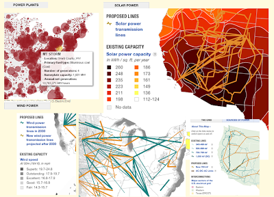
Visualizing the US Alternative Power vs. Current Grid


This visualization of the current national power grid and comparisons of several alternative energy "landscapes" (Solar, Wind, etc.) is an intriguing comparison of current power network to potential new sources of energy in an environment of ever increasing "power-hungry" demand.


Quick "Cut & Paste" highlights:


The nation’s electricity grid is facing a crisis -- it’s outdated and unprepared for increasing demand and a future that includes more renewable sources of energy. A new digital smart grid is part of the picture envisioned by advocates, as is building new electricity infrastructure.


Credits:

To Flowing Data for bringing it to my attention, and these NPR folk (below) for putting it together:


Sources: American Electric Power, American Wind Energy Association, Center for American Progress, Department of Energy, Edison Electric Institute, Energy Information Administration, Electric Power Research Institute, Federal Energy Regulatory Commission, National Renewable Energy Laboratory, U.S. Environmental Protection Agency, Western Resource Advocates
Credits: Producer: Andrew Prince; Designer: Alyson Hurt; Editors: Avie Schneider and Vikki Valentine; Supervising Editors: Anne Gudenkauf and Quinn O'Toole; Additional Research: Jenny Gold; Database and GIS Analysis: Robert Benincasa

Saturday, April 18, 2009

LA vs. NY - the Geography of Buzz - Cultural Mapping


A great comparison display of the geography of media - first brought to my attention by
Flowing Data - it continues the rivalry of two American centers of culture.

Quick "Cut & Paste" Highlights:
" ...Elizabeth Currid (USC) and Sarah Williams (Columbia University), collaborate to map the
geography of buzz ..... mined thousands of photos from Getty Images which provided a dataset of parties in art, music, fashion, movies, film, etc and created density maps which in turn show the hip places to be...."


Full Article - Click Here

References / Credits:
FlowingData RSS feed , NY Times


Sunday, April 12, 2009

Ross Store Growth - Temporal Mapping


Full credits to Flowing Data - another neat map expose - themed over time - of store growth over the company's life.


Still Not Cool Enough for FaceBook

This Cool visual display of Facebook growth - by time & linkage concentrations - comes from a mix of Facebook, the New york Times, and the brilliant site Flowing Data.

Even at 200 million users, I'm still not "cool enough" for FaceBook. Honestly, keeping up with family, work, school, LinkedIn., my own site and the demanding readership (0.2 readers & growing) on this blog - I'm a bit "socialed out".


References / Credits:

Friday, January 30, 2009

Target vs. Wal-mart - coming to FlowingData.com soon

Taken from the fascinating visual display of store growth over time, http://www.flowingdata.com/ put together the "dot expansion" of Wal-mart, then Target - and promises for a comparison visual are equally intriguing.

I claim no such greatness of creation skill, only wanted to help spread the exposure of brilliant output.

Click thru and enjoy.

Wal-mart Growth


Target Growth

If you love the visual display of quantitative information, I highly recommend subscribing to the FlowingData feed.